In 1963, one of the first ‘public’ pieces of art I did was a pencil portrait of one of my Grandads. It was realistic, recognisable and admired. It went back up to Barrow with him, was framed and lived on the mantelpiece. It was drawn side on, which is easier, and I have always had a delicate touch with pencil shading. I was just beginning to understand art, what I could do and what I was less successful at.
Since then life has been one long session of ‘if at first you don’t succeed, then try, try and try again’. I’ve always had the shakes, I’ve always had my brain suddenly lose concentration. If I pick up a ruler and start measuring my inability to hold numbers in my head soon makes me lose control. I’ve always tended towards the ‘real’ and away from the romantic, picturesque or theoretical (pointillism, cubism etc.). There is good art everywhere but I sometimes think too much theory loses some of the power that exists in early cave paintings. When I first saw the ‘Arnolfini Couple’ I was entranced by it but I soon became fonder of Bruegel the elder and then onwards into the whole of human and animal expressions of creativity.
Slowly I’ve got a better grasp of what I can and can’t achieve and used that to push the boundaries and increase what I can say with my work. This is the story of one of those explorations.
At our art group exhibition earlier this year, my young friend Georgina put up a work she had done for A level art, based on L.S.Lowry.
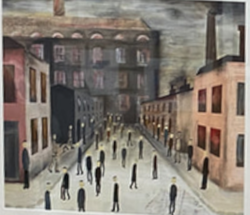
I’m not a great fan of Lowry but I also have no time for people who are snobby about his work and if I started listing the artists who I’m not fond of, it would be a long list. Georgina’s painting made me think about how things have changed. I wondered if I could do a version that started in the past and moved forward to the present, where every other person seems to be walking about with a throw away coffee cup in their hand.
I did a quick mock-up and asked Georgina if it was OK for me to use her work as a basis.
When she said yes, I went and looked at Lowry images. This one is called ‘Coming Home from the Mill’ from 1928.
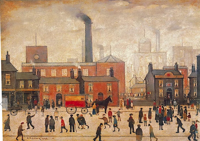
The first thing that hit me was how much movement and expression there is in the work and how colourful it is. The next was how well-off the scene looks despite the background. It crosses class boundaries. If you’ve ever been near one of those mills, or factories or a big engineering works when everyone clocks off their shift then you will not recognise it in this scene. Next impression was how technically competent it is. Most people would be horrified at the task of detailing so much. Although the perspective is simplified, it is still basically accurate. In true Lowry style, there are no shadows to complicate things and the light and shade is simplified. The surface on which the figures walk has no subtleties of depth and texture, but the figures are placed on that surface and not floating in air. It is not a naive painting. While a Vermeer, for instance, is always masterfully painted, it is nearly always a staged moment in time with little hint of movement. I think the Lowry captures elements of life much better.
I realised that, as with other artists, we often get an idea about someone and fail to look more carefully or ask what their intended meanings and motivations were.
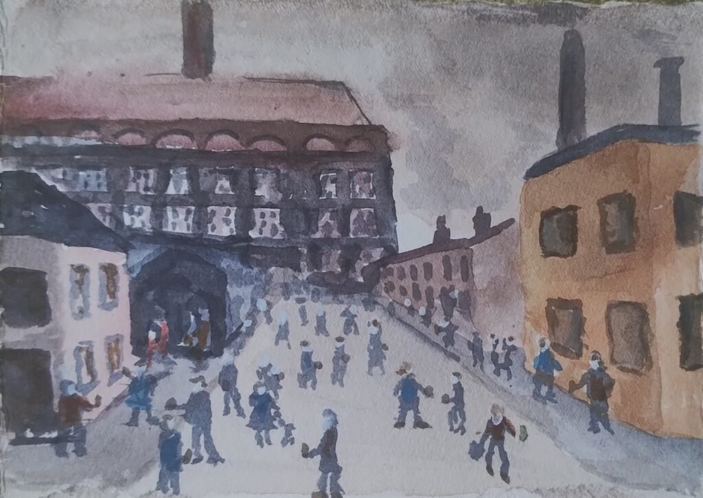
So now we come to my effort. Because of a workshop we did, I decided to do it in watercolour. While I am used to the medium, I do not normally use it for these complicated group scenes. This is the first choice on which the jury is still out.
I sketched the background in and left the street much like Lowry’s and light coloured so that I could paint the figures on with less problem.
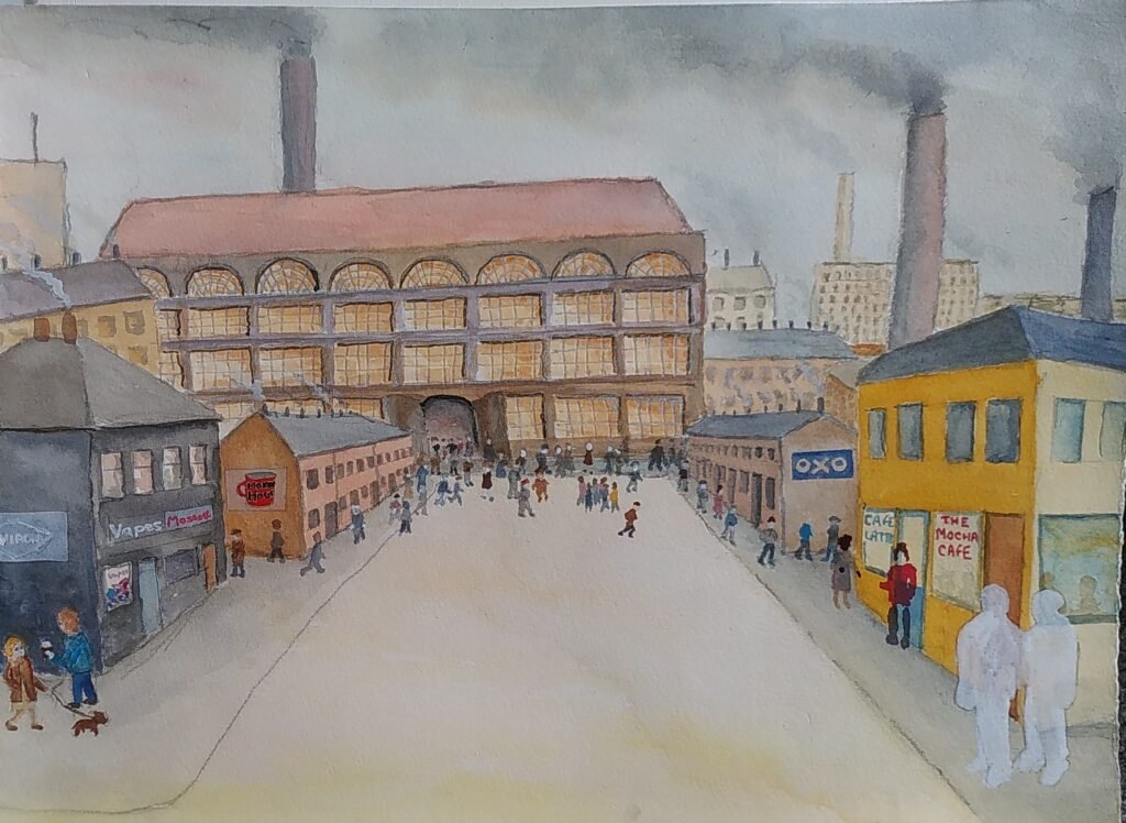
As you can see, at this point I realised that my perspective was inconsistent and that I needed to paint out the area where I wanted two foreground characters. Art doesn’t have to be a slave to perspective but is helps if your decisions about it look intentional. I decided I might be able to make the perspective thing work. The trouble with something complicated like this, when you are an unreliable and inconsistent painter like me, is that the more you add on the greater the fear of suddenly ruining it. An earlier me would have torn it up and thrown it across the room by now and probably sworn never to paint again. I’m a bit more at ease with my imperfections now.
Here is the current state of things:
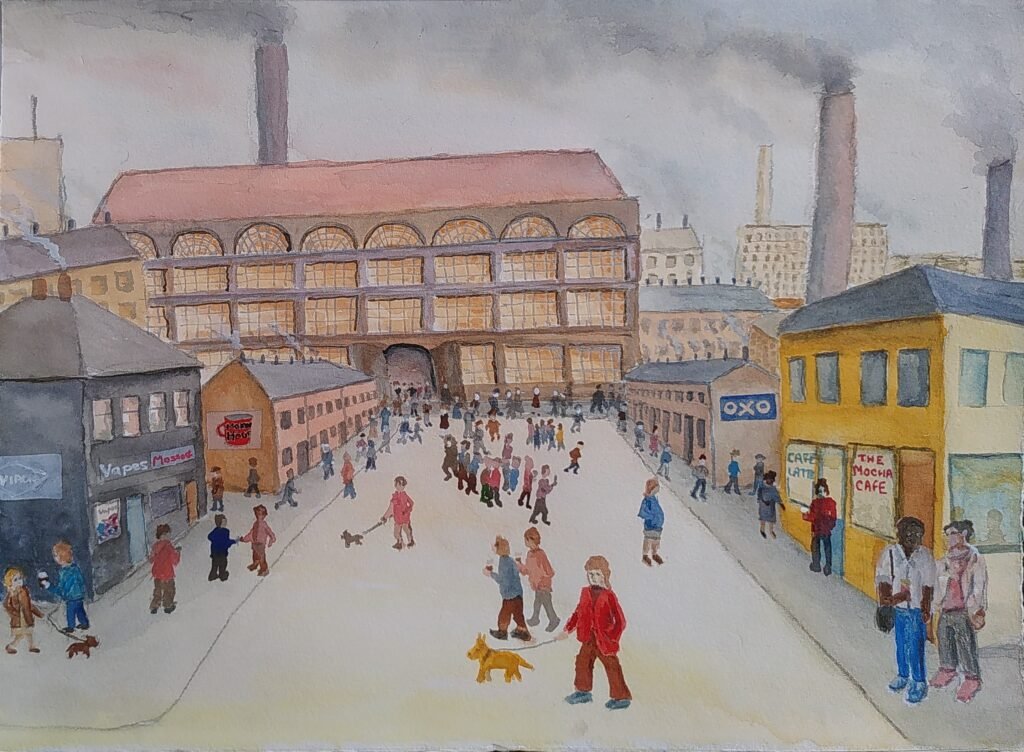
Call me pretentious if you like, but the idea is that the area near the big mill is the past and time moves forward through the picture. The two wall adverts on the terrace rows are probably more about the time when Lowry died, when instant coffee was in charge and almost no adverts showed men cooking. In the front there are coffees being carried, they have different names, more people have dogs that they can name the breed of, usually somehow related to a poodle cross, and they often expect them to be able to go into cafes with them.
Does it work though? It is certainly not photographic and in my world view that is good. My figures are cartoonish, as they have often been. That is perhaps consistent with the Lowry and I often admire cartoonists. The perspective is not fully convincing but you do feel like you could walk into the picture, especially if you were being distracted by holding on to your dog and coffee at the same time, perhaps while trying to stop your messenger bag sliding off your shoulder.
One of the problems with works that have messages is that they potentially fail if the message is not clear. Could you get the messages without me explaining them? Have I tried to put too many little messages in and lost focus?
As always I can see all the problems in this picture, but I can also see positives in it. It will probably sit around and after I’ve had a rest from it I may spot a way, within my competence levels, to improve it in my eyes. I’ve even managed to improve things years later. I’ll move back to something that I feel uses my abilities better, or that other people will smile at quicker but I’ll keep trying things that stretch me because I’m still learning.
I hope you’ll keep experimenting too.