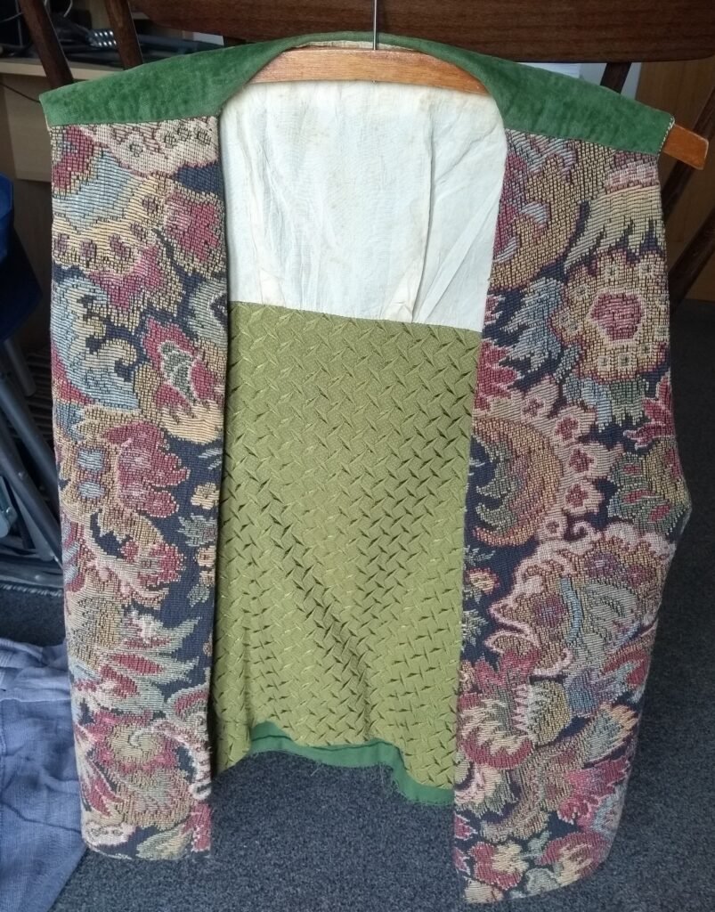
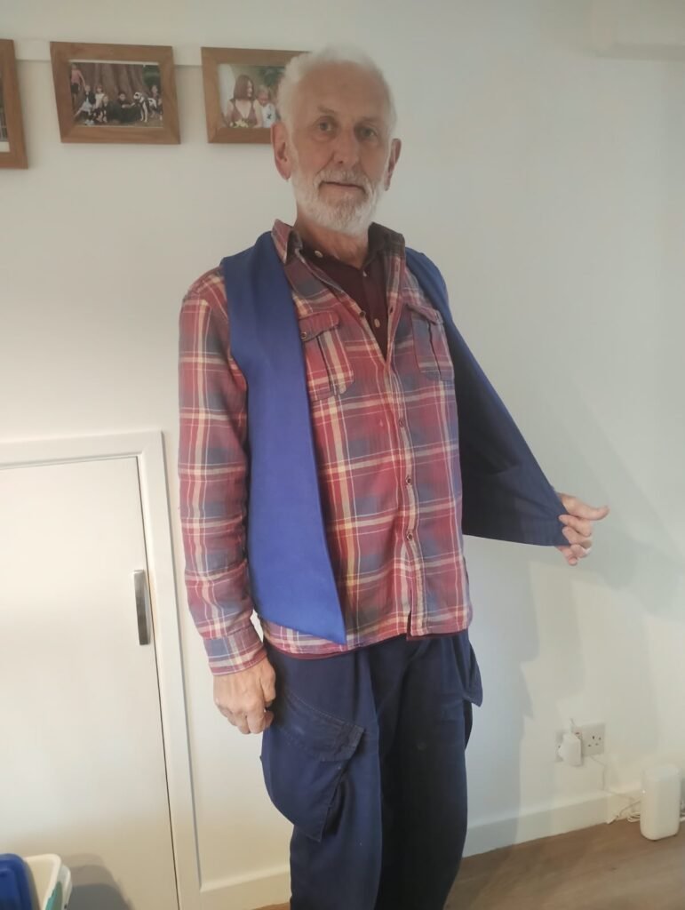
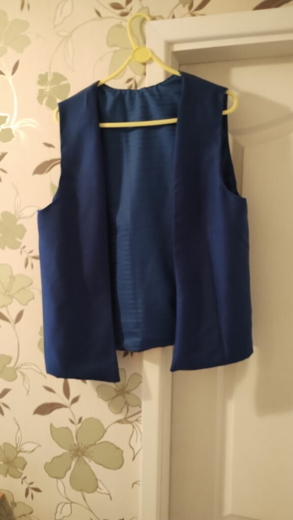
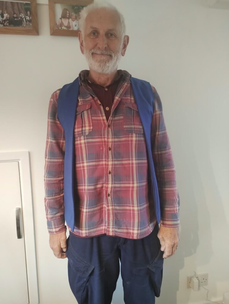
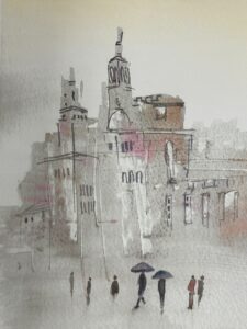
I set myself a summer project when I was at college and, with the help of my mum, made a waistcoat that is still in use today. This year I decided to try it again.
So with the help of Sam Chandler and Julie Fish, I managed another one made out of beautiful materials.
I’ve always been lucky enough to be able to develop skills. Those skills have drawn other people’s attention which is a mood boost but which can also put you under pressure.
I’ve taken the privilege of that attention seriously and watched others to help develop those skills further. I’ve never taken things for granted. I try to push boundaries on my abilities and widen the range of messages I can include in work. I also love to try to pass skills on to others. I learn from that as well. So here are some examples of development that I hope will encourage you to keep going.
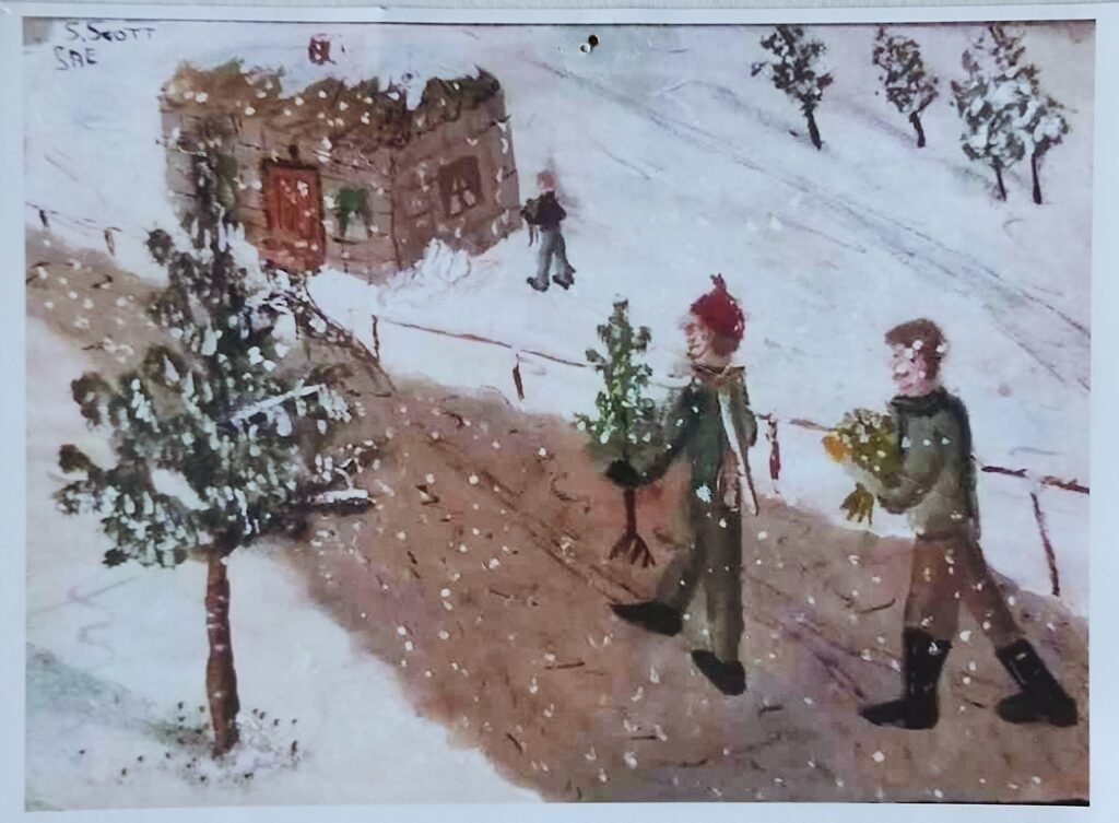
School Christmas Scene
This was done in the mid 1960’s with gouache, which is not the easiest thing to paint with. I was a naive 15 year old with no experience of painting scenes, no real knowledge of art and I made the whole thing up without reference to any other images. Other people had more sophisticated painting and drawing skills than me but it wasn’t a bad painting. Apart from a Gandalf on someone’s window, I rarely painted people again until this next one.
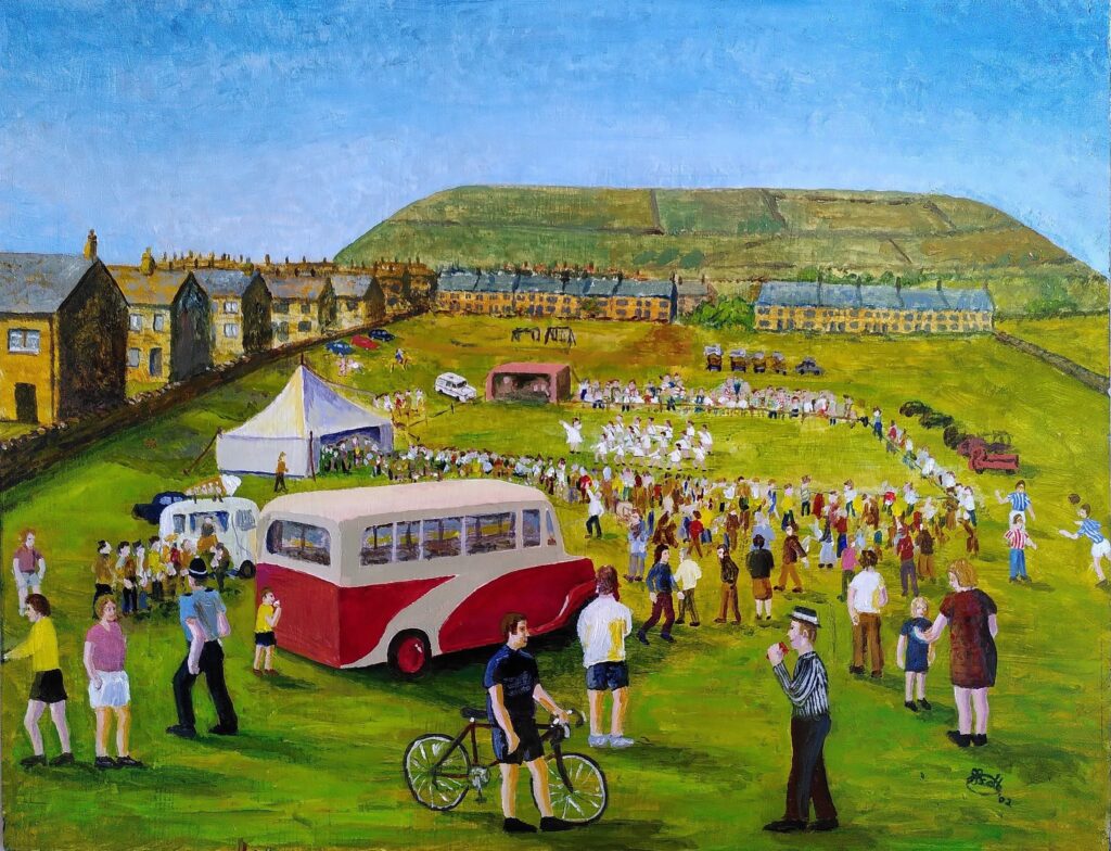
Meltham Carnival re-coloured
This was started in the 20th Century and finished in the 21st. People like it, despite its slight naivety. I knew the place and used some photos to remember things like the bus. The scene arrangement is completely made up as I painted it. Because it is in acrylic I was able to paint over and improve it over time.
Long Company Mumming
This is a real place again and a real event and photos were used as guides. The details of the scene itself and the figure placements are completely imagined. By this time I was starting to be more able to make decisions about tonal and colour balances and levels of detail required. Acrylic paint allowed me to develop the scene steadily, starting from overall colour and light ideas and developing and building up layers, even removing bits that don’t work.
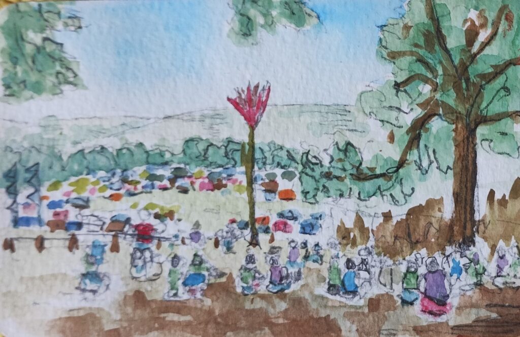
This is just a sketch from a music festival. This one manages to capture a scene without getting too trapped in detail. Watercolour usually forces you to make compromises to capture a rapidly changing scene. Freedom of expression is sometime too easily forgotten. My growing skill with the medium has given me that freedom. By this time the work on the more formal scenes and constant practice on site have given me a more relaxed level of control. Whether you are working from a scene in front of you or one built up from one or more photographs, the aim is to get to a point where you are building a painting rather than copying what is front of you.
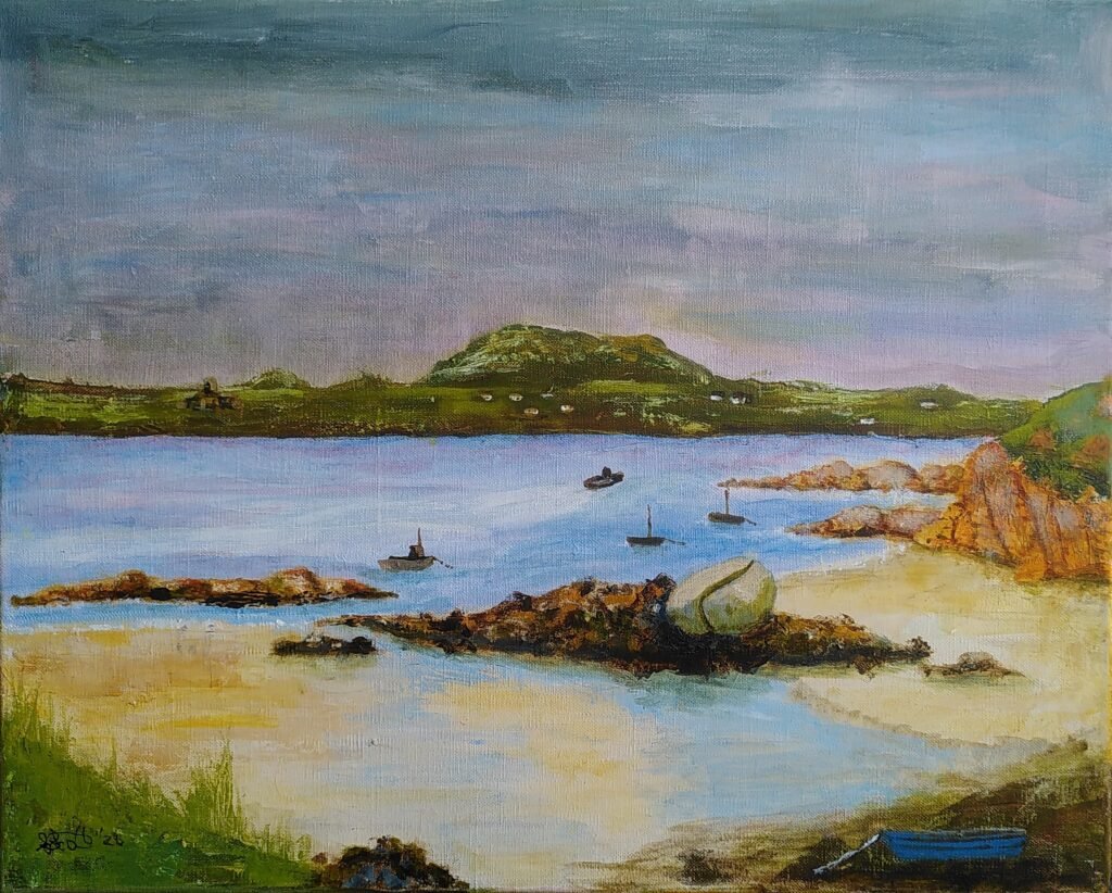
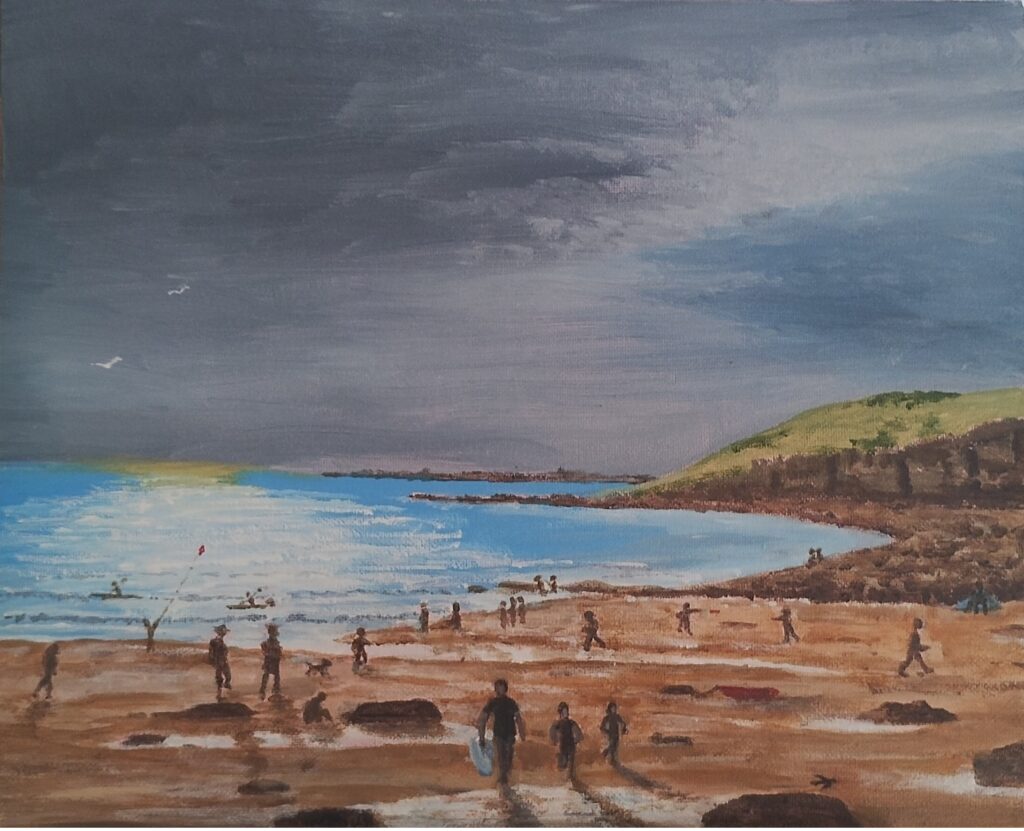
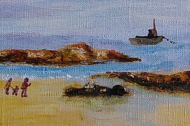
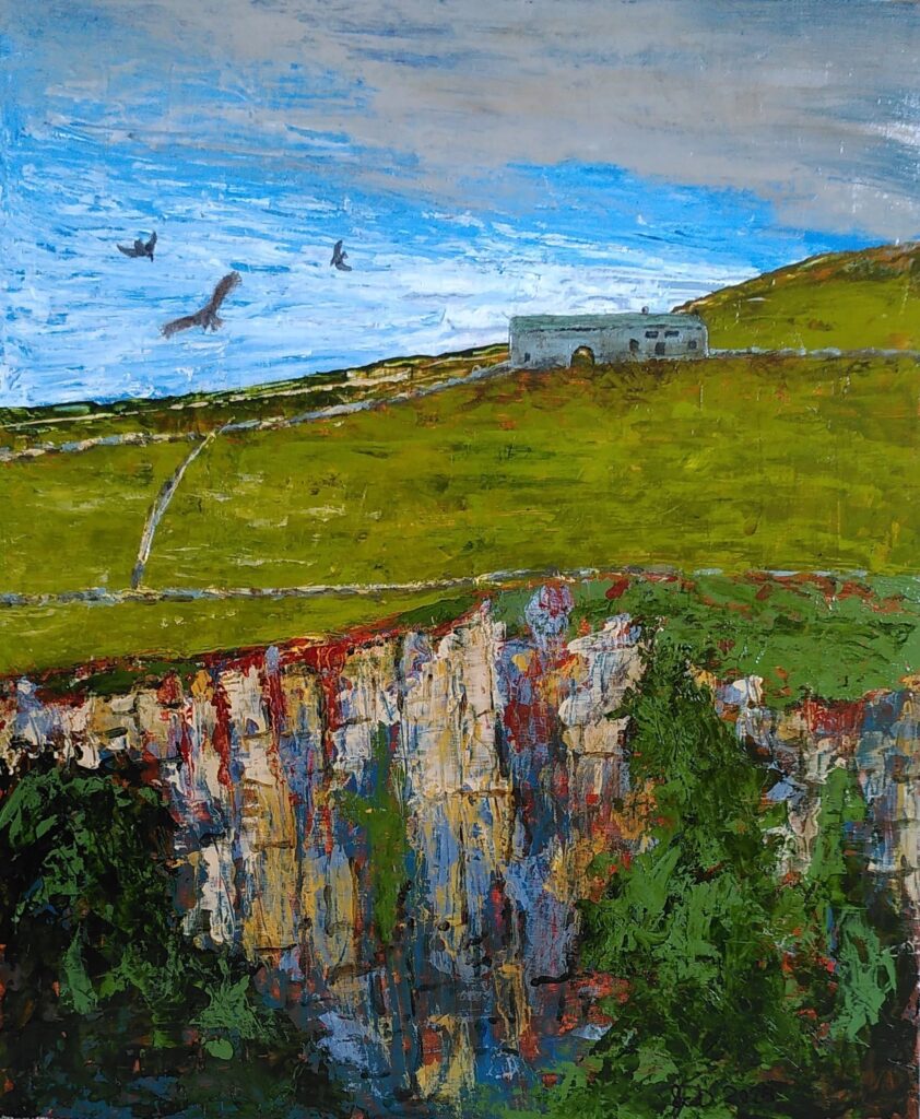
Dunraven Day End
This a a more recent one and reflects some of my present day habits. I made a sketch on the spot and took some photographs. I made some mini sketches of what I wanted to include. The background cliffs are as near the original sketch as possible to capture the day and then the rest was added trying to capture the mood of the whole day, including packing up to go home. By the end of painting this I am no longer looking at other images, just at the painting and whether it is satisfying in itself. For complicated things like little figures I might try out brush sketches on a separate surface, like the paper covering my desk. This allows you to develop quicker and more effective brush strokes.
Desk Sketch
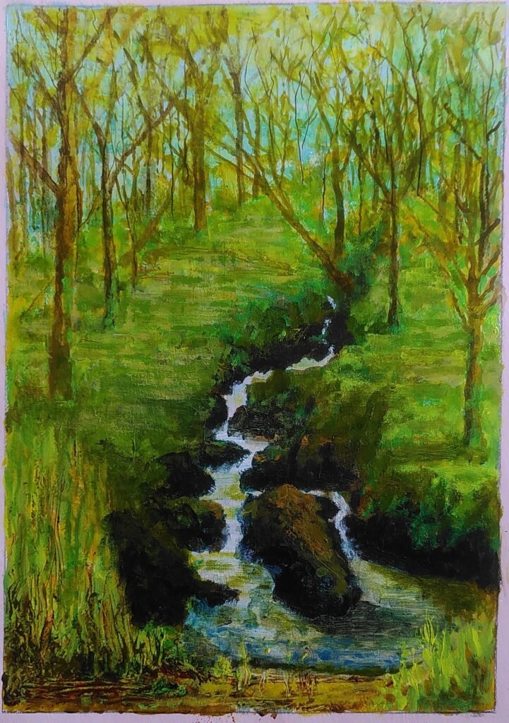
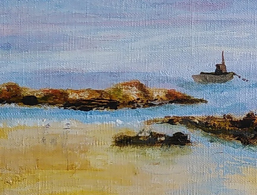
Those examples are all social scenes, which are particular difficult to capture. There is nothing ‘wrong’ with my first effort but I hope you can see that constant development allows me to have more choices and better control over what emerges. As the years have gone by I have managed to get less trapped in the picture or thought that I am working from and this allows me to have the creation of the new picture clearer in my mind. It allows me to stare at the picture and decide where it needs to improve and the best way to do it. Here is an example of a landscape. It is a second development from a sketch. The first development had a family group and a Highland cow on. I decided to do without the cow this time but quickly added the people in. Staring at it made me realise that they didn’t add anything worthwhile so I just painted them out.
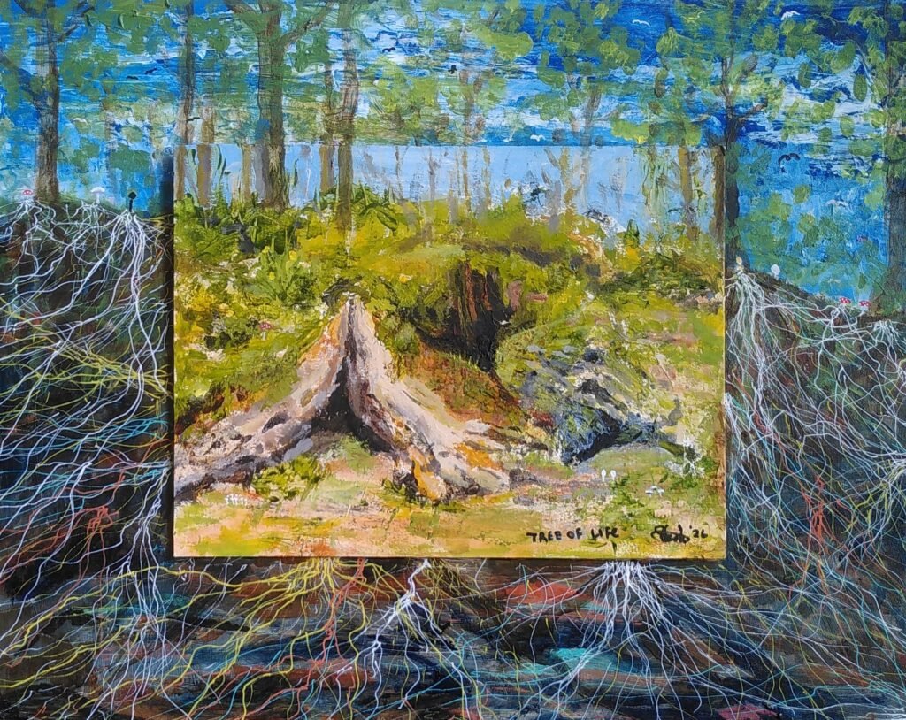
Below is a painting from a completely different ‘theme’, one that probably suits my own thoughts and way of working more readily, but all the same I could not have achieved it without applying lessons learned from others and the experiment and development that went before it.
I hope you will keep going and find ways of working that suit you.
Since I started with Shelley Art Group I have tried to make a habit of writing up any learning sessions we do. I’ve just realised that an early one on with, Heather Burton, using these knives slipped out of my brain. As I now use these tools on most of my acrylic painting I thought I should correct that.
At the workshop I just felt out of control throughout but there was something about the freedom of it and the way it created interesting textures that made me persist. Here’s one I created just after the workshop:
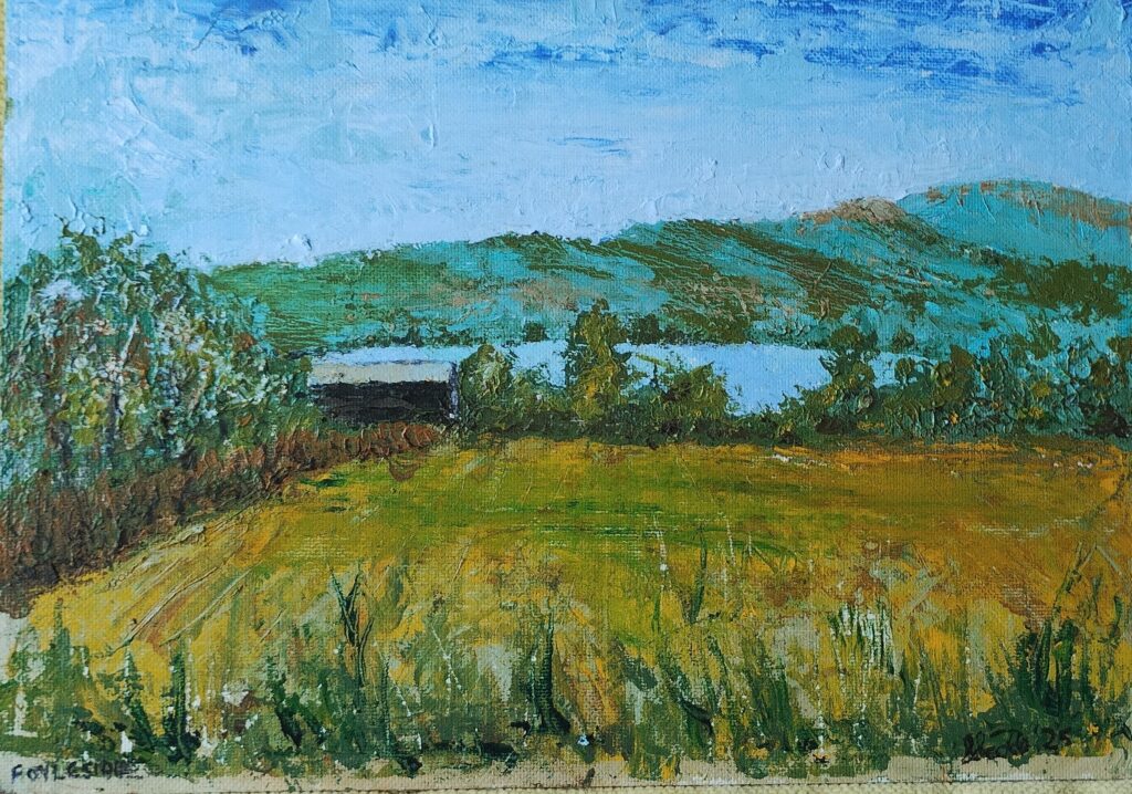
Foyleside Farm
I based it on a sketch I did some years ago and it was successful enough to hang in the farm and to encourage me onwards.
One of the other members at the workshop (Julie) persisted as well and I ended up buying a painting she made. Her descriptions of some of what she’d found added to my store of knowledge. I experimented a bit more and decided to go on a workshop at Heather’s house. Here’s what came out of that (with a lot of work afterwards too):
Digley Airshow
Hopefully you can see that the skills have come on somewhat. Here is a fragment of another.
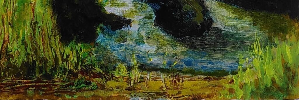
Wood of Cree fragment
That fragment shows the sort of textures, lively colouring and sense of life and movement the pallet knives can give you. You don’t have to use the knife for everything but it is a really useful tool. This post explains some of the techniques, hints and tips for success.
The first tip I picked up from Julie was to make sure you make a good base surface before you start. You can use a heavy paper or board or canvas but also make sure you give it a good gesso base coat as well.
Like me you may associate pallet knives with thick paint layers. You can try this but, like Heather, I recommend that you start with flat layers. If you leave raised or ridged areas it makes subsequent layers much harder to apply. You can layer paintings in a quite traditional way even with the knives.
Related to the thin layers is the fact that you can scrape paint off as well as put it on. If you make what you think is a mistake scrape it off. Don’t worry if it doesn’t all come off. You will have the most success if you embrace freedom and experiment. If you are used to very neat layers of paint you can let the paint dry and paint over but my next tip means that you don’t have to do that.
Instead of mixing exactly the colour you want and laying it on carefully on the canvas or as a thin semi transparent layer over another colour, you can part mix the colour on the pallet and then play with the mix on the painting. You can scrape areas out with the edge of the knife to create lines of colour variation. Look at the fragment and I think you see evidence of some of this.
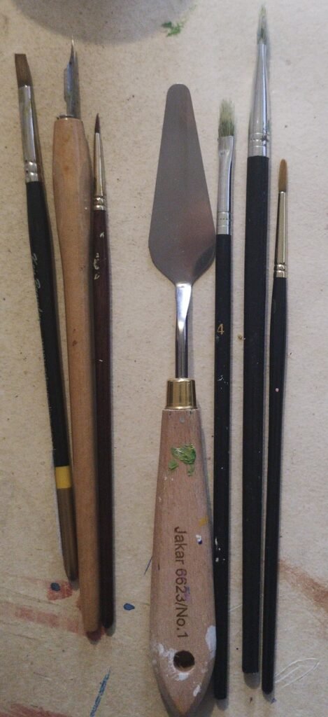
Tools for painting
Less a thicker bristle brush, the picture above show the tools on my desk from a painting I recently completed. The dip pen is for thin acrylic ink marks.You don’t have to stick to one tool. I might apply paint with a knife and then decide a bit more subtle merging is required and so. go over it with a dry brush. Or you can do it with a damp brush to get a smoother effect. Forget the rules and experiment. The pallet knife above is part of a cheap set. They need to be flexible. I have bought a couple of slightly more specialist ones but I don’t use them much. I have usd edges of card to make thinner marks too. Make sure you have old cloths at hand. One of the lovely advantages of pallet knives is that you can simply wipe them clean, though I usually see if any spare paint mix can be used elsewhere on the painting as well.
When applying the paint, pick some up with the knife and apply it to the surface edge first and then drag across, slowly flattening the knife to apply more paint as you go. Don’t worry too much about it. You can pick/scrape paint up if there is too much. Remember you want to leave a fairly flat surface at first so pick up ridges in particular unless they are an intended part of the final painting.
Look at the quarry in the Digley Airshow above. Heather suggested making the marks vertically and that has worked. Any texture in the paint aligns with the nature of the object you are creating and gives a more marked contrast to any marks in a different direction.
As Heather just replied to me, remember not to give up. As I wrote in another post, you have permission to play. Keep going and I think you will find a freedom and a range of techniques that work for you.
The full Wood of Cree painting using the illustrated tools:
That’s it for the moment. My ageing brain is shouting at me to stop. I’ll come back for more another time.
In 1963, one of the first ‘public’ pieces of art I did was a pencil portrait of one of my Grandads. It was realistic, recognisable and admired. It went back up to Barrow with him, was framed and lived on the mantelpiece. It was drawn side on, which is easier, and I have always had a delicate touch with pencil shading. I was just beginning to understand art, what I could do and what I was less successful at.
Since then life has been one long session of ‘if at first you don’t succeed, then try, try and try again’. I’ve always had the shakes, I’ve always had my brain suddenly lose concentration. If I pick up a ruler and start measuring my inability to hold numbers in my head soon makes me lose control. I’ve always tended towards the ‘real’ and away from the romantic, picturesque or theoretical (pointillism, cubism etc.). There is good art everywhere but I sometimes think too much theory loses some of the power that exists in early cave paintings. When I first saw the ‘Arnolfini Couple’ I was entranced by it but I soon became fonder of Bruegel the elder and then onwards into the whole of human and animal expressions of creativity.
Slowly I’ve got a better grasp of what I can and can’t achieve and used that to push the boundaries and increase what I can say with my work. This is the story of one of those explorations.
At our art group exhibition earlier this year, my young friend Georgina put up a work she had done for A level art, based on L.S.Lowry.
I’m not a great fan of Lowry but I also have no time for people who are snobby about his work and if I started listing the artists who I’m not fond of, it would be a long list. Georgina’s painting made me think about how things have changed. I wondered if I could do a version that started in the past and moved forward to the present, where every other person seems to be walking about with a throw away coffee cup in their hand.
I did a quick mock-up and asked Georgina if it was OK for me to use her work as a basis.
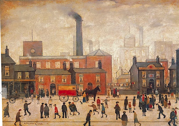
When she said yes, I went and looked at Lowry images. This one is called ‘Coming Home from the Mill’ from 1928.
The first thing that hit me was how much movement and expression there is in the work and how colourful it is. The next was how well-off the scene looks despite the background. It crosses class boundaries. If you’ve ever been near one of those mills, or factories or a big engineering works when everyone clocks off their shift then you will not recognise it in this scene. Next impression was how technically competent it is. Most people would be horrified at the task of detailing so much. Although the perspective is simplified, it is still basically accurate. In true Lowry style, there are no shadows to complicate things and the light and shade is simplified. The surface on which the figures walk has no subtleties of depth and texture, but the figures are placed on that surface and not floating in air. It is not a naive painting. While a Vermeer, for instance, is always masterfully painted, it is nearly always a staged moment in time with little hint of movement. I think the Lowry captures elements of life much better.
I realised that, as with other artists, we often get an idea about someone and fail to look more carefully or ask what their intended meanings and motivations were.
So now we come to my effort. Because of a workshop we did, I decided to do it in watercolour. While I am used to the medium, I do not normally use it for these complicated group scenes. This is the first choice on which the jury is still out.
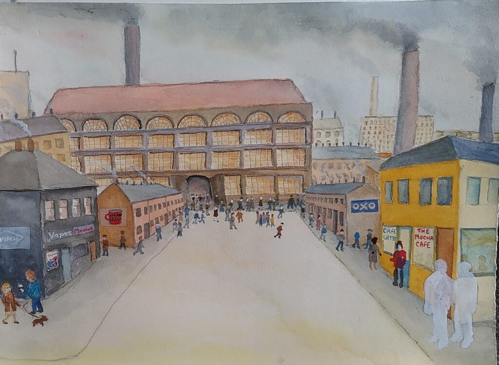
I sketched the background in and left the street much like Lowry’s and light coloured so that I could paint the figures on with less problem.
As you can see, at this point I realised that my perspective was inconsistent and that I needed to paint out the area where I wanted two foreground characters. Art doesn’t have to be a slave to perspective but is helps if your decisions about it look intentional. I decided I might be able to make the perspective thing work. The trouble with something complicated like this, when you are an unreliable and inconsistent painter like me, is that the more you add on the greater the fear of suddenly ruining it. An earlier me would have torn it up and thrown it across the room by now and probably sworn never to paint again. I’m a bit more at ease with my imperfections now.
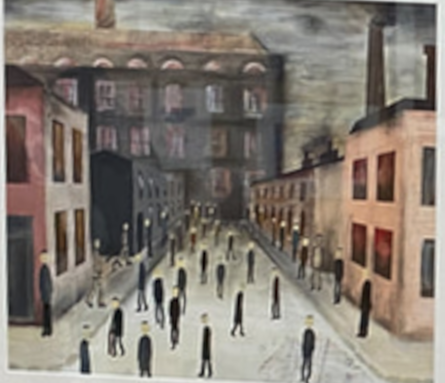
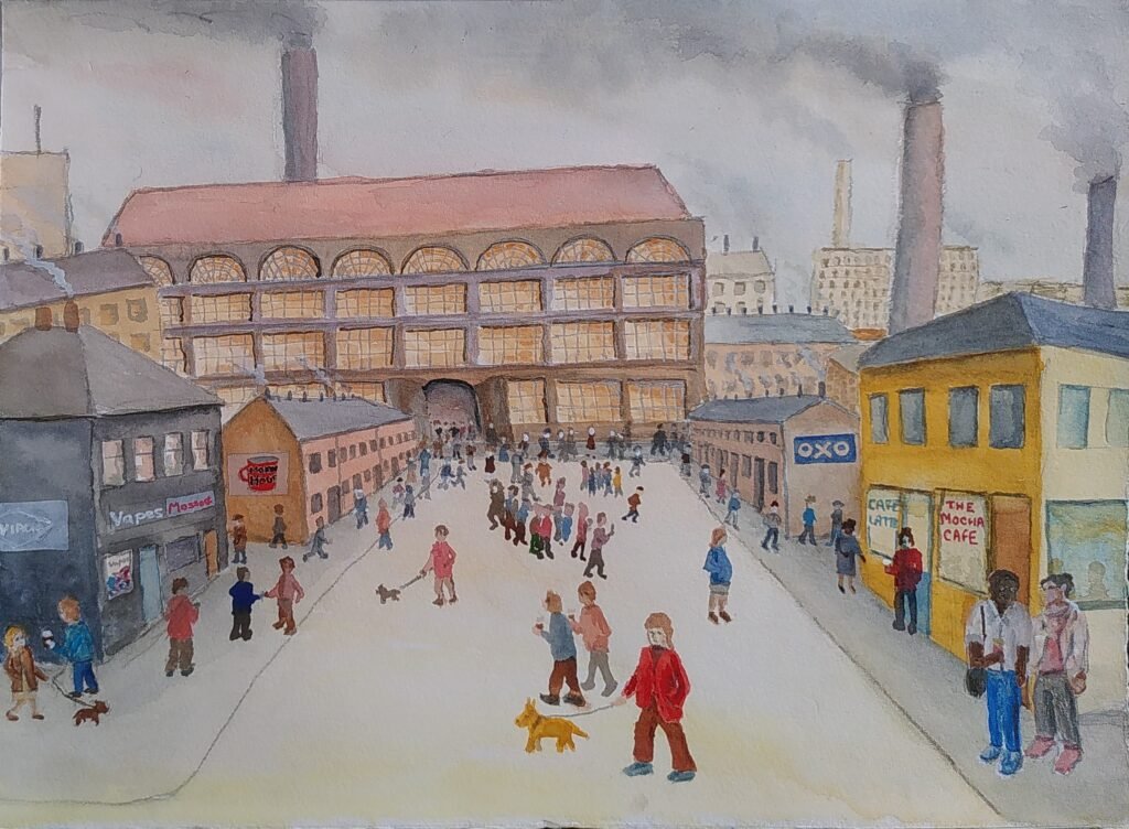
Here is the current state of things:
Call me pretentious if you like, but the idea is that the area near the big mill is the past and time moves forward through the picture. The two wall adverts on the terrace rows are probably more about the time when Lowry died, when instant coffee was in charge and almost no adverts showed men cooking. In the front there are coffees being carried, they have different names, more people have dogs that they can name the breed of, usually somehow related to a poodle cross, and they often expect them to be able to go into cafes with them.
Does it work though? It is certainly not photographic and in my world view that is good. My figures are cartoonish, as they have often been. That is perhaps consistent with the Lowry and I often admire cartoonists. The perspective is not fully convincing but you do feel like you could walk into the picture, especially if you were being distracted by holding on to your dog and coffee at the same time, perhaps while trying to stop your messenger bag sliding off your shoulder.
One of the problems with works that have messages is that they potentially fail if the message is not clear. Could you get the messages without me explaining them? Have I tried to put too many little messages in and lost focus?
As always I can see all the problems in this picture, but I can also see positives in it. It will probably sit around and after I’ve had a rest from it I may spot a way, within my competence levels, to improve it in my eyes. I’ve even managed to improve things years later. I’ll move back to something that I feel uses my abilities better, or that other people will smile at quicker but I’ll keep trying things that stretch me because I’m still learning.
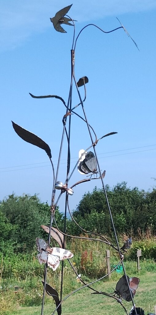
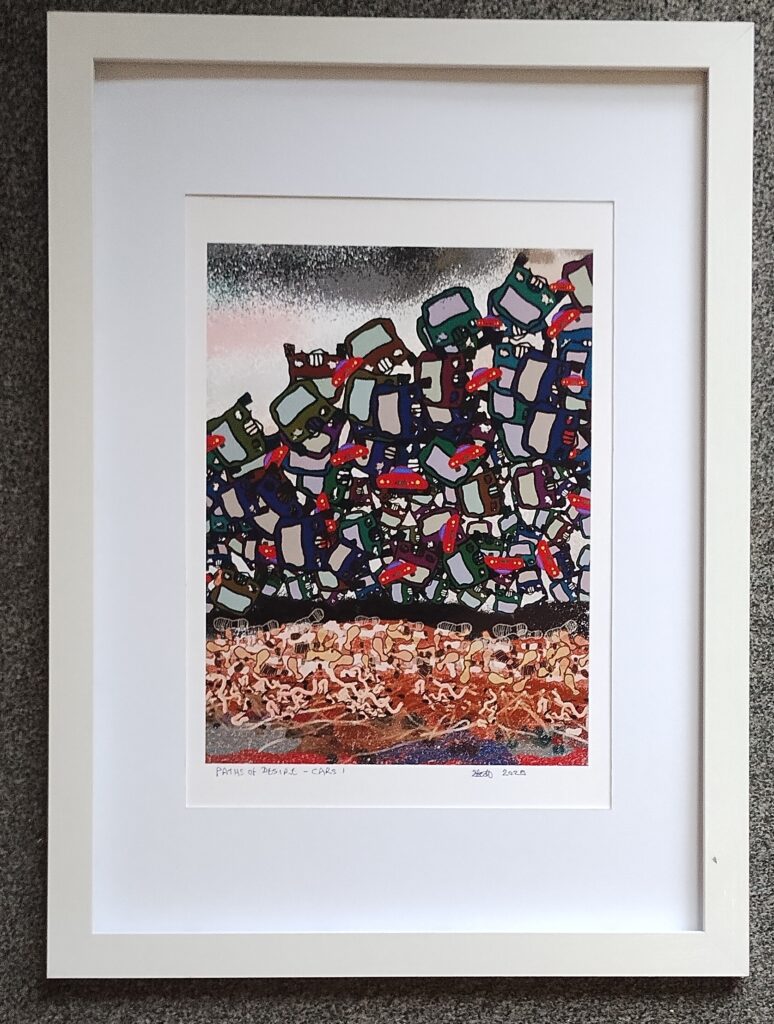
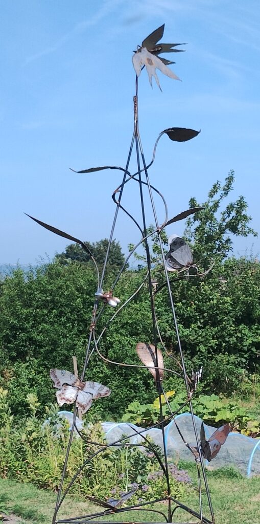
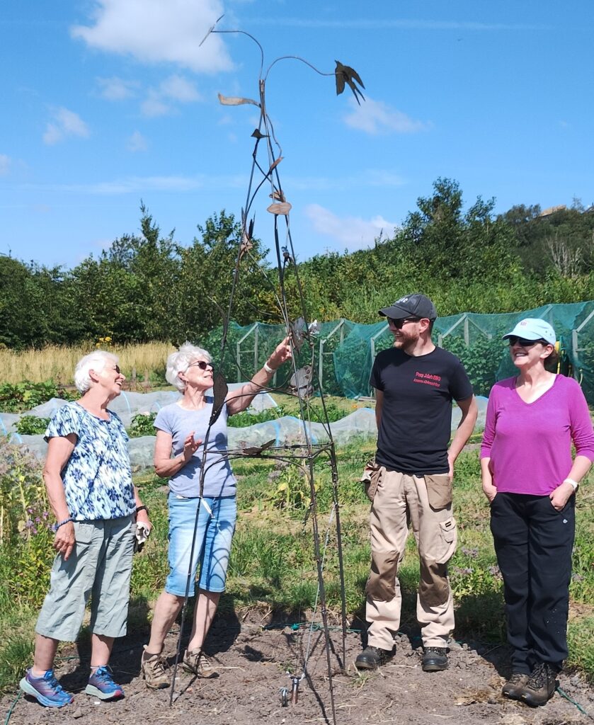
This week I installed a sculpture paying homage to birds and butterflies at Stirley Farm, a charity project showcasing organic gardening and protection and encouragement of wildlife. The same week a friend asked if she could have one of my Paths of Desire series that depicts the effect of immoral and selfish overuse of cars on everything from the soil to wildlife and us. I’ve donated the sculpture and, as usual, the full sale cost of the other artwork goes straight to a charity, bypassing me. A week with smiles in it.
I’ve avoided painting from photographs most of my life, especially other people’s but I am softening with age. Whatever keeps you going.
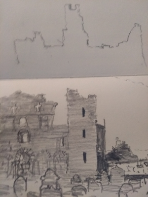
At the moment I want to do a painting based on a sketch of Lindisfarne Priory I did a few years ago. Oddly I find it harder to transcribe shapes from a sketch than I do from a scene in front of me.
I suddenly had a brain wave and I took a photo of the sketch that I had taken for the web and edited it into two photos, one for each half. While I was at it I reversed each of the halves.
I printed each half out on a4 scrap paper and then I had a reversed A3 version of my tiny sketch. I then used conte pencil to draw round the main lines of the sketch on each sheet, turned it over on the painting surface and rubbed. Hey Presto an A3 version of the original, the right way round. I’ll use photos to help me add more texture and detail.
If only I’d thought of that when I was copying an old abstract etching of mine onto a plastic sheet for our printing session last year.
Yesterday evening Stacey Shaw gave us a session at Shelley Art Group. This is my attempt to summarise the messages she gave us and to add my own angles on it. Stacey reminded us that it always worth remembering the basics and used some good teaching methods to get across the messages clearly.
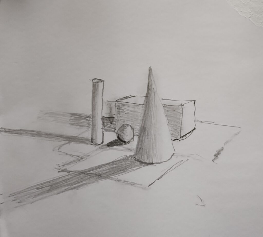
We started out with an arrangement of white cube, sphere, cone and cylinder. Stacy asked us to think how we could start to establish the shape on paper.
My quick version of the arrangement.
A quick word on pencils. For years I used 5b and 6b most of the time. nowadays I tend to start with 9b. These soft pencils encourage a freer touch and you can also make them very light as well with practice. A textured paper works well for some subjects but smooth is often better for pencils. Pencils are naturally textured.
The cube has defined lines that give us its shape. It makes sense to sketch those lines in, if only to establish the perspective (if you want to stick to that perspective).
The sphere looks like a circle but we can usually see straight away that it is a sphere. Drawing the outline can help you to make it circular rather than some other shape but you run the risk of giving the sphere an edge. If you don’t trust your shape drawing (who does?) then draw the outline but make it as light and sketchy as you can. The sphere optical edges are defined by where it goes out of our line of sight and where the background objects disappear behind it. You could begin to detail the shape by putting in the background objects.
Both the cone and the cylinder are versions of the sphere but with edges. If you chopped the sphere in two, you would have a sphere with a tricky perspective circle, in effect making it a figure with two faces. To indicate the shape better you could make lines that follow or indicate the shape and that would allow our brains to pick up those hints. To get a more nuanced shape definition we use the light which gives us shading and shadow. Tracey put a light on the objects to emphasise both of these. She also told us to make sure that we were constantly looking at what was actually happening with the shade and shadow and not making assumptions about what was happening. When I came to draw the grouping of objects I soon realised that the light source was slightly rounded, exaggerating the way the light radiates out and both the shading and shadows went in different directions for each object. When the close, directed, light was turned off there were multiple shades and shadows from the many lights in the room. Also the object themselves reflect some light onto other things around them.
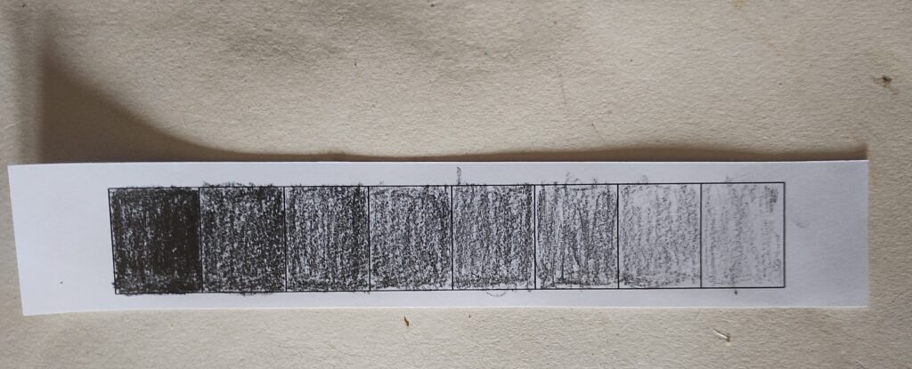
Shading strip. Notice the shadows the strip makes and how exaggerated they are
That of course is the simple bit. Tracey quite rightly had a moan about denigrating art in education, when it is actually a very complex subject with multiple technical and social aspects to it. I’ll now try to set out, briefly, some of the other lessons from the session.
Without getting tied up by it, always try to remember that every object that you draw is a shape like these ones. It will have actual edges, points where it disappears from our view and surfaces which have a shape of their own (concave or convex, facing us, angled to us etc.). Even texture is a set of mini shapes on the surfaces of the object. There will also be perspective.
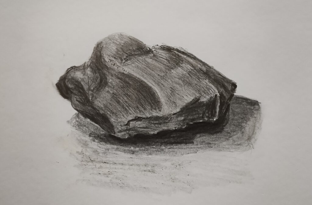
I drew this stone without drawing any edges at all. Just started shading bottom right.
Try to resist getting too caught up with drawing edges on things.
Using the shape information, try to separate the effects of light and shade from the competing shades given by the colours of the object. Tracey gave us a strip of squares to shade from dark to light. If part of the object is light yellow and part dark blue, the shading differences given by the lighting and shape on each colour are likely to be mostly consistent across the colours.
Where objects have colour, the reflected light from them has some colour also. This can affect adjacent objects.
When you are drawing or painting try to make sure that your body, arm and wrist positions allow you as much free, smooth and controllable movement as possible when you are making your marks. I have had shakes and jerks all my life, so have to get the position right and wait for the right moment.
Keep comparing your version with what is in front of you and remembering the basics set out above. Look at what you are producing from further away, as this gives you a better sense of the overall shape. There is a famous experiment where people were given a drawing to copy. If the were made to keep the original drawing upside down they generally made a better job of it because they had less tendency to draw what they thought they saw.
Of course these guidelines are mainly of value if you want to produce a persuasive facsimile. That isn’t the only aim of most pieces of work. It does help to have learned how to imitate things even if your aim is to do something else with them.
Last night I was at a workshop given by Sarah Moss, on watercolour landscapes including people. The group included those who mostly paint with watercolour and those who rarely do, people who paint in completely different ways and some who have little experience of the more technical aspects of this medium. This is an attempt to explain and simplify things a bit. I’m not going into detail about different sorts of watercolour paint, more the way of application and the papers.
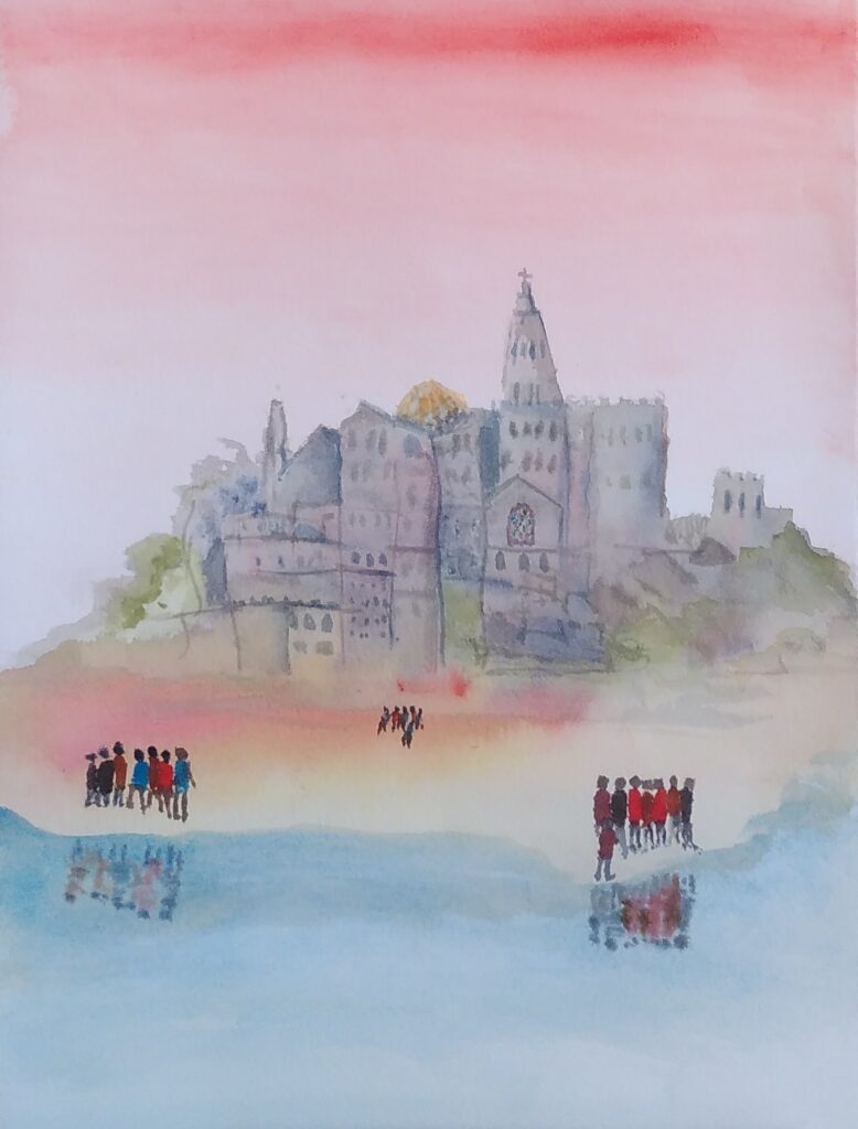
This is what Sarah was getting us to paint (though I managed to miss that and made up my own).
Those of you with experience may realise straight away that this may be better on a slightly smoother paper. It is also painted using a wet on wet technique, which means putting lots of water on the paper and letting the paint flow on the surface.
Sarah said that 200lb paper would be best. Immediately we are into issues that can be confusing, with jargon in the advert or on the pad of paper can be somewhat off-putting. The good news is that Turner and his contemporaries mostly used writing paper to paint on with watercolours. That is because the writing paper of the day was reasonably heavy and had absorbency that took the ink but didn’t spread it around. The other good news is that, once you find a paper that works with your style, you can just buy it on repeat until you want to try a different way of doing things.
One jargon area is weight of the paper. Sarah specified that in lb (lbs), which relates to the, well past retirement date (unless you are American or old like some of us), Pounds and Ounces system. So we already have lb, lbs and pounds for one measure.
Another, more universal, measure is GSM, which is grams per square metre. The trouble is that there is no easy conversion between the two. That is because they measure slightly different things. Both are slightly odd in measuring on a flat scale (e.g. square metres) something that can have a whole range of thicknesses. Then, for a particular thickness there can different densities. Oh dear. So 200lb watercolour paper is usually 425gsm. That is a heavy paper. Because I have it, I used some old hand-made paper that is like card for the workshop. For most uses I would buy the heaviest that you feel you can afford both to buy and to waste. If it is lighter weight you can stretch your paper (wetting it till it expands and taping it down while it dries to make it tighter and less prone to wrinkling) but that is not without its problems, or you can put up with the wrinkling but that just makes the painting harder to control.
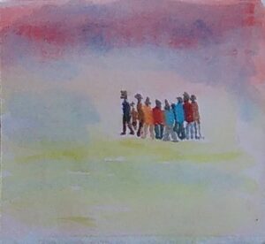
People Painting test
Let’s go back to the texture of the paper. This is indicated in various ways. It might be a reference to a particular way paper was made once e.g Bockingford or a manufacturing technique (NOT which has been Cold Pressed or Hot or even Rough). Papers move from smooth through to those that have a quite pronounced 3d texture. Some famous watercolourists use the texture of the paper to give visual texture to the paint. Sarah talked about adding texture with the paint by bleeding (having adjacent areas both wet or removing colour (blotting) from particular areas. She also introduced the idea of denting the paper (with the end of the brush handle) to make the paint pool in those areas. That way you get the effect of different paper textures where you want them, not all over the paper. Textured papers are like the wrinkled paper, there are peaks and troughs and pigment runs into the troughs. There is also more surface area, because of the little bumps, so that can make the paper appear relatively more absorbent. Apart from the little tricks that you pick up, I would get a small amount of each and play with it to see what happens. Then, alongside the weight you can afford, pick the paper that feels like the ones you were most satisfied with.
The final topic here, at least for the moment, is absorbency. Paper is lots of fibres squashed together. The paper often has glue(size) spread over the surface to fill in the ends of fibres that are facing upwards and to make a paper with a more controlled surface texture and absorbency. Some papers have size internally as well. I wouldn’t bother thinking about this too much. Just try experimenting over time, ask people who do it a lot or perhaps you could read up a bit. Just remember that people love to repeat the little they know as, often inappropriate, wise advice (including me of course).
I hope the message has come across to keep trying different things. If it helps, make notes, so you can recreate the successful efforts. I know I had enormous fun playing last night, painting in a way that was different to much that I do normally. I was happy with what I produced and will add it all to my stock of different options when I set out to paint something.
My version
Of course, I had the right paper for the occasion, watercolours in tubes put into a palette that I use all the time, brushes that were of reasonable quality and that I am used to (the main flat brush I used is nearly sixty years old). So keep it simple, try different things in a reasonably organised way and be prepared to ask questions. Mainly have fun.