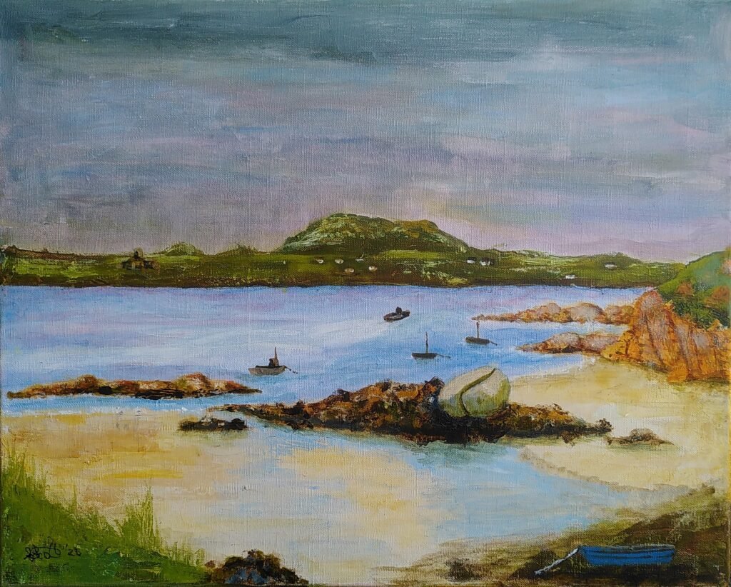
This week I installed a sculpture paying homage to birds and butterflies at Stirley Farm, a charity project showcasing organic gardening and protection and encouragement of wildlife. The same week a friend asked if she could have one of my Paths of Desire series that depicts the effect of immoral and selfish overuse of cars on everything from the soil to wildlife and us. I’ve donated the sculpture and, as usual, the full sale cost of the other artwork goes straight to a charity, bypassing me. A week with smiles in it.
Shelley are visiting The Hepworth Gallery Gardens in Wakefield on a sketching outing. I thought I’d give you a bit of (hopefully) entertaining background on one fascinating aspect of the place.
The Gallery is actually built on an Island. On one Side is the River Calder, which of course meanders there all the way from the hills above Hebden Bridge. Alongside the route of the Calder are various bits of canal that are sometimes pure canal and at others join the river. From the Hepworth onwards, the canals start getting much bigger. If you are sat in a narrow boat in one of the locks you suddenly feel small and vulnerable.
‘Hepworth’ Island
Just by the Hepworth a canal cut runs away from the river and the Hepworth is on the island made by that bit of the canal and the river. On the other side of the bridge from the car park there is a boat yard servicing the canal. I once watched a canal boat being lifted from a lorry, over the boat yard and into the water by the footbridge. You are now in the flat and marshy land east of the Pennines.
Shelley Village Hall is in a different sort of place. It is on a hill that is part of a river catchment area. On one side of the watershed a river runs down the valley towards Huddersfield and on the other the water runs down into the valley through Denby Dale. The river running to Huddersfield joins the Colne and Holme rivers and heads north east joining the Calder at Cooper Bridge. Meanwhile the River Dearne on the other side heads off to the Sculpture Park before shooting off south east to join the Rother going through Rotherham. Rivers seem to do odd things.
All the rivers mentioned so far are eventually headed towards the Humber and Hull. They are part of a much bigger catchment area. One part starts in the Hills above Settle, where rivers head across to Lancashire, up to Cumbria, over to Tyneside and, of course, down through Yorkshire. All those Dales and places like York that we like to visit have rivers that eventually end up in the same place.
Perhaps more astonishingly is all the rivers, like the Dearne that eventually reach the Humber from a southerly direction. The Dearne joins others coming down from the south Pennines, including the Don before joining the Ouse on its way to the Humber. That wasn’t always true though. Until some amazing river engineering by a Dutch engineer the Don joined the most astonishing tributary of the Humber. This one originally flows through another place associated with the Arts – Stoke on Trent. Yes, a whole set of rivers on the other side of the Pennines meander around as the Trent heading southwards, then turning east and finally north, before joining up with the water from Shelley and heading to the sea.
So, as you sit sketching on your engineered island, think about the amazing geography of rivers and human attempts to control and use them. Your Shelley water flows down below our house in Ossett in both a canal and a river. Coal from pits under Thornhill was originally transported on the canal, before the railways were built in the same valley. Incidentally, the flood defenses built near the Hepworth lost a traditional foot route and Ruth is part of a group working with the Council, the Canal and Rivers Trust and Sustrans to get routes restored for pedestrians and wheelchairs and cyclists. Another set of connections in my fascination with what I’ve called Paths of Desire.
I’ve avoided painting from photographs most of my life, especially other people’s but I am softening with age. Whatever keeps you going.
At the moment I want to do a painting based on a sketch of Lindisfarne Priory I did a few years ago. Oddly I find it harder to transcribe shapes from a sketch than I do from a scene in front of me.
I suddenly had a brain wave and I took a photo of the sketch that I had taken for the web and edited it into two photos, one for each half. While I was at it I reversed each of the halves.
I printed each half out on a4 scrap paper and then I had a reversed A3 version of my tiny sketch. I then used conte pencil to draw round the main lines of the sketch on each sheet, turned it over on the painting surface and rubbed. Hey Presto an A3 version of the original, the right way round. I’ll use photos to help me add more texture and detail.
If only I’d thought of that when I was copying an old abstract etching of mine onto a plastic sheet for our printing session last year.
Last night I was at a workshop given by Sarah Moss, on watercolour landscapes including people. The group included those who mostly paint with watercolour and those who rarely do, people who paint in completely different ways and some who have little experience of the more technical aspects of this medium. This is an attempt to explain and simplify things a bit. I’m not going into detail about different sorts of watercolour paint, more the way of application and the papers.
This is what Sarah was getting us to paint (though I managed to miss that and made up my own).
Those of you with experience may realise straight away that this may be better on a slightly smoother paper. It is also painted using a wet on wet technique, which means putting lots of water on the paper and letting the paint flow on the surface.
Sarah said that 200lb paper would be best. Immediately we are into issues that can be confusing, with jargon in the advert or on the pad of paper can be somewhat off-putting. The good news is that Turner and his contemporaries mostly used writing paper to paint on with watercolours. That is because the writing paper of the day was reasonably heavy and had absorbency that took the ink but didn’t spread it around. The other good news is that, once you find a paper that works with your style, you can just buy it on repeat until you want to try a different way of doing things.
One jargon area is weight of the paper. Sarah specified that in lb (lbs), which relates to the, well past retirement date (unless you are American or old like some of us), Pounds and Ounces system. So we already have lb, lbs and pounds for one measure.
Another, more universal, measure is GSM, which is grams per square metre. The trouble is that there is no easy conversion between the two. That is because they measure slightly different things. Both are slightly odd in measuring on a flat scale (e.g. square metres) something that can have a whole range of thicknesses. Then, for a particular thickness there can different densities. Oh dear. So 200lb watercolour paper is usually 425gsm. That is a heavy paper. Because I have it, I used some old hand-made paper that is like card for the workshop. For most uses I would buy the heaviest that you feel you can afford both to buy and to waste. If it is lighter weight you can stretch your paper (wetting it till it expands and taping it down while it dries to make it tighter and less prone to wrinkling) but that is not without its problems, or you can put up with the wrinkling but that just makes the painting harder to control.
People Painting test
Let’s go back to the texture of the paper. This is indicated in various ways. It might be a reference to a particular way paper was made once e.g Bockingford or a manufacturing technique (NOT which has been Cold Pressed or Hot or even Rough). Papers move from smooth through to those that have a quite pronounced 3d texture. Some famous watercolourists use the texture of the paper to give visual texture to the paint. Sarah talked about adding texture with the paint by bleeding (having adjacent areas both wet or removing colour (blotting) from particular areas. She also introduced the idea of denting the paper (with the end of the brush handle) to make the paint pool in those areas. That way you get the effect of different paper textures where you want them, not all over the paper. Textured papers are like the wrinkled paper, there are peaks and troughs and pigment runs into the troughs. There is also more surface area, because of the little bumps, so that can make the paper appear relatively more absorbent. Apart from the little tricks that you pick up, I would get a small amount of each and play with it to see what happens. Then, alongside the weight you can afford, pick the paper that feels like the ones you were most satisfied with.
The final topic here, at least for the moment, is absorbency. Paper is lots of fibres squashed together. The paper often has glue(size) spread over the surface to fill in the ends of fibres that are facing upwards and to make a paper with a more controlled surface texture and absorbency. Some papers have size internally as well. I wouldn’t bother thinking about this too much. Just try experimenting over time, ask people who do it a lot or perhaps you could read up a bit. Just remember that people love to repeat the little they know as, often inappropriate, wise advice (including me of course).
I hope the message has come across to keep trying different things. If it helps, make notes, so you can recreate the successful efforts. I know I had enormous fun playing last night, painting in a way that was different to much that I do normally. I was happy with what I produced and will add it all to my stock of different options when I set out to paint something.
My version
Of course, I had the right paper for the occasion, watercolours in tubes put into a palette that I use all the time, brushes that were of reasonable quality and that I am used to (the main flat brush I used is nearly sixty years old). So keep it simple, try different things in a reasonably organised way and be prepared to ask questions. Mainly have fun.
Despite the fact that humans can’t help doing art and have always done so, the world of art is full of rule making and snobbery.
Cave Painting
There is a famous story about Constable, that Reynolds chided him for using such lurid colours in his landscapes, advising using tones related to a valuable old violin. Constable is reputed to have carried the old violin outside and laid it on the grass to demonstrate how mistaken that was. I’m not that fond of Constable’s paintings but that story is an example of rules and how they can lead to stagnation. I’m also pretty sure too that more people have heard of Constable than Reynolds and can picture a painting more readily.
Muted Colours?
The other thing that story inadvertently highlights is the question of who you are painting for. Reynolds was envisaging elite admirers and customers and also that you are painting to fit with an historic story of painting ideals. Constable was painting to suit himself and his view of reality and perhaps also more ordinary viewers of his paintings.
Hidden rules of this sort are everywhere, even in the world of amateur art. Can I suggest that you be aware of them, but also ignore them if they don’t help you to achieve what you want to do? You should paint or draw to please yourself, to keep developing your skills and to sometimes make yourself smile at what you’ve managed to do. It is even better if you can please other people at the same time.
Rule 1 – Don’t paint by numbers, which is a term for drawing lines round everything to establish shape, size and position and then filling in the shapes with colour and or tone.. This is pure snobbery and I suspect has only really existed as a rule since the Impressionists. The Sistine ceiling was painted by sketching in some detail into the wet plaster then following with the paint blocks.
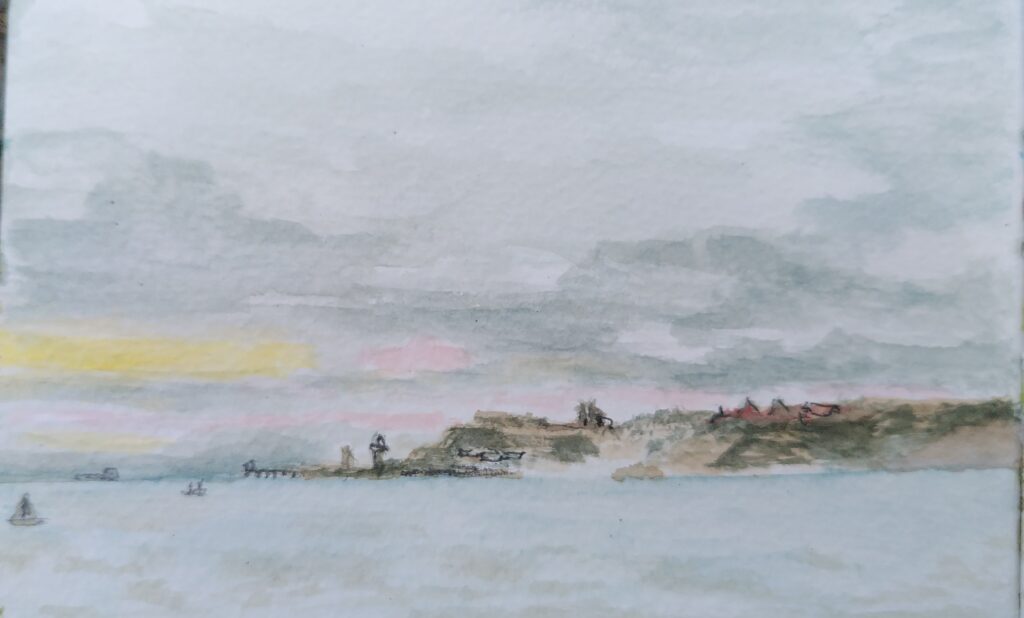
The idea is that you should be able to choose and make a mark without drawing it out in detail and then filling in the blocks. The level of natural skill and vision required to even get close to that is immense. If you can aspire to get nearer, it is enough. Do less drawing and simplify the structure of your paint if you can but don’t think you are a lesser person if more freedom doesn’t work for you. A good example of this is wet on wet watercolour painting (you can do it with acrylic as well to some extent). The opportunities for chaos and disaster are as large as the chances of creating something free and inspiring. Keep trying though, as you may get a pleasant surprise. Here is one of a sun going down seen through a window in the rain. I did it as a sketch for another painting. I thought it had just gone out of control but later saw a good bit within it and over-painted a couple of unwanted marks.
Incidentally there is a halfway house in watercolour between blocks of pure colour and wet on wet. Because of its transparency, if you start light, you can gradually add darker layers over the top. If you do it reasonably quickly and use you brush in the right way, you can activate some of the pigment in the lower layer to produce subtler gradations like you can get with wet on wet. You can also brush water onto the relevant areas of the lower layer, to activate the pigment in those areas before you add the higher layer.
Rule 2 – Develop your own style and stick to it. Sadly this is sometimes necessary if you want to have a loyal customer base. Galleries particularly like artists to do this. It is good to try to individualise your work but it shouldn’t be a shackle for you, holding you back from invention and creativity.
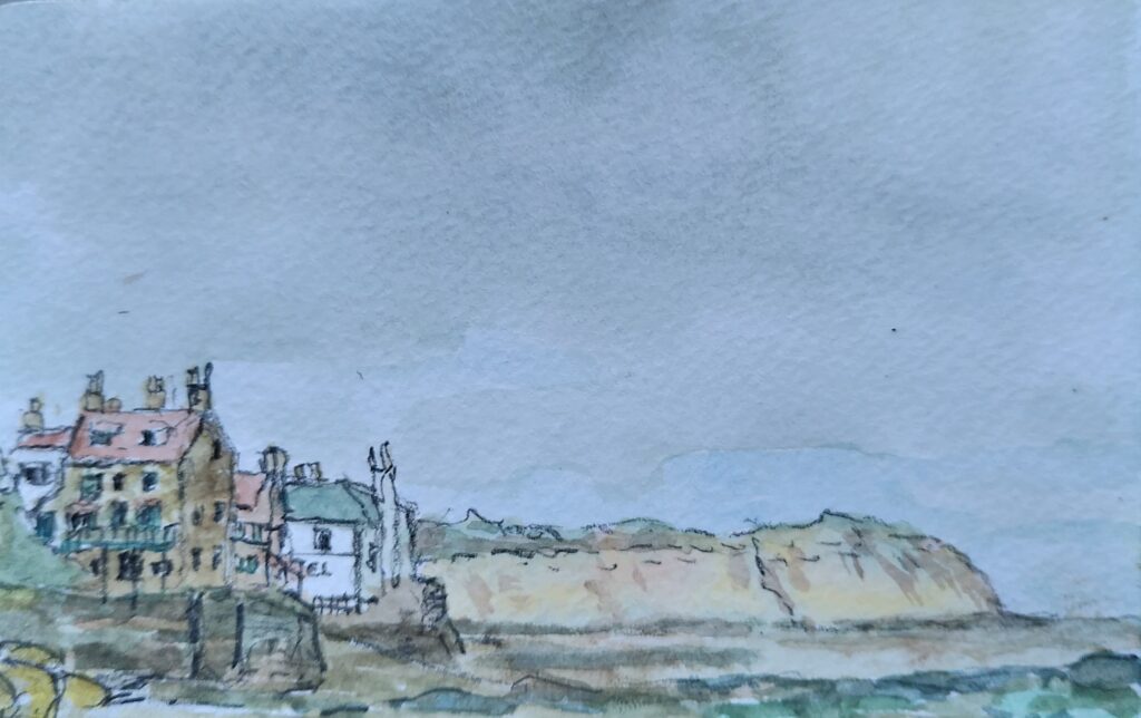
Rule 3 – Paint big. This attitude pervades in a lot of art. Anyone who went to the recent Turner Prize exhibition in Bradford will have seen this in action. If Turner had tried to exhibit the beautiful, tiny watercolours that are held in the National Gallery of Scotland collection, he wouldn’t stand a chance. Paint/draw/collage whatever size and with whichever medium you can make work and that achieves what you want to achieve. It is nice if you can show respect for whatever subject you have chosen too. Not a patch on Turner, but this one of Robin Hoods Bay is only 9cmx14cm and pleases me.
Robin Hoods Bay
Don’t mix mediums. To some extent this is practical. Oil paint doesn’t mix well with other mediums. Modern paints are now much more flexible. Surprisingly effective results can be obtained by mixing opaque and transparent mediums, for instance. Read about the limitations and abilities of the mediums and methods but also carry out your own experiments. Scraps of paper allow you to test something before you put it on your work. Give yourself freedom to try out different ways of making marks, with different tools and materials. Enjoy playing like that child’s drawing at the top.
There is a term applied to art, that is often used in quite different ways, which is ‘artistic license’. I’m not very fond of the term, as it implies it is something used only by artists and some people see it as akin to lying. When we look at anything, all of us are able to concentrate on what pleases us and ignore what does so less, like the cars roaring past an attractive scene and their smell and noise. When things are committed to memory we are even more selective. When we paint or draw we are always painting or drawing emotions to some extent. We are just making a hard copy of our normally selective vision and memory.
That is enough rules for today. Be aware of the rules and treat them as possible helpful guidelines but don’t let them hold you back from expressing yourself. Try to learn the little tricks that allow you to achieve a more fluid and lively look with improved textural feel. Recognise when to pause something that is going out of control and when to quickly remove some of the paint with a rag to make it easy to try it again later.
Enjoy watching and experimenting. Don’t tear things up and instead look at them later and see whether they can be rescued or which bits worked better and can provide a lesson for later.
Yesterday I was at a Contemporary Landscape Painting workshop with Pippa. It was very stimulating, so I thought I’d pass the basics on.
We started by dividing a good sized piece of reasonably heavyweight cartridge paper into three rows and then making marks across each row with palette knife and undiluted acrylic paint. Desperately not thinking of landscapes we used a dark, medium and light colour in each, perhaps with a warm or cold colour relationship.
Make sure to leave a good quantity of white paper. On one row at least the dark should be black. The marks should overflow to give colour and texture subtleties. There should be slightly stronger areas of pigment and others could be almost scraped off. Don’t get too fussy.
Next take a small mount cut out and keep laying it over the paper to see if any interesting shapes or images emerge. You can twist the mount at whatever angle works. Pick as many images as you fancy playing with. They can’t overlap, as the next task is to cut them out and stick them to a sheet of paper to work on. In those bits you can think about landscape at last. You can paint over any bits that don’t work and add detail that adds more shape, distance and texture.
Lastly we did some larger (but still small for this exercise) pictures using the same stages on each piece of paper – Making flat marks in three colour shades, with different strengths, overlaps and textures. Doing it reminded me of Heather Burton’s advice to block in shapes quickly in flat colour at the start of a palette knife piece and the abstract session where we folded a paper that we had worked on to highlight different sections and stimulate new ideas.
The exercise aimed to give more liveliness to compositions. Using flat acrylics allows you to add layers of subtlety and detail afterwards.
Apparently in another workshop Pippa gave people, when working from a photo or someone else’s painting, the advice turn the original over for the last third of the time working on it. That way you turn it into your own work but also start looking at the painting in the way you need to better do your own original work. Sound advice.
CrashTumbleCascade
This approach allowed me to free up a painting I’d been struggling with, trying to capture a day at Glencoe’s Signal Rock site, when there were many dragonflies. Not perfect but improved. Thanks again Pippa.
One earlier stalled attemptDragon Fly DetailsDragonfly DetailPost Pippa Version
Angela at the Shelley Art Group I go to said the other day that we should enjoy it when we work on something. Very wise. This when everyone else was painting a bit like Monet, while I just messed about. Previously, I’ve tended to expect to produce a finished product when I start painting or drawing. When it doesn’t work out right, I would get annoyed with myself.
Over the years the huge number of times I’ve been out sketching, often in public, have helped me relax more. Age and experience have probably helped too. Sometimes I even produce things that people really like.
Angela isn’t the only one who has recently helped me enjoy it more. When we were doing a session on abstract art there was a tip about folding up what you produce, snipping it and looking it from different perspectives. Now I’ve also got used to playing with palette knives and raw paint often mixed on the picture, that has also allowed me to take a more relaxed approach.
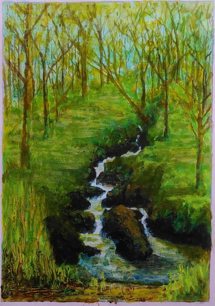
So when I wanted to paint a picture of Ruth sitting by the Coe river, as in Glencoe, from a sketch done when there were masses of dragonflies about, I started playing with both the picture and with different ways of doing dragonflies. I fully expected it to be haphazard, scruffy and throwaway. As it evolved I kept trying new ideas, Some work better, some don’t. Taking photos and cropping them allowed me to look at different compositional ideas and highlight what worked.
The penultimate one there was where I started on a more finalised version. Adding a bit of sky peeping through the foliage told me to do a layer of sky first and then trunks and foliage on top. On the right I wanted to make the foliage stand out as nearer to give more depth. I’ve got to add three people in there too. It kept me going for a while, but kept looking at the sketch, thinking I was not really making any improvement. Finally I reached a point where it had achieved what I set out to do. It adds something to the sketch but I still probably prefer the sketch overall. It does include the hint of dragonflies for the close observer too.
If you are playing with acrylics, particularly with a palette knife, you can use cartridge paper or heavy grade lining paper but put a ground coat on beforehand, as it helps the paint move. This tip I owe to Julie and it helps make the acrylics behave more like oils, rather than the watercolour-like method used by Anthony Barrow. I am in the habit of using white gesso mixed with a touch of red for some reason.
Where I had little hope that I could manage it with my skill set, I now think I may be able to have another go using what I’ve learned. I may have accidentally produced a bit of a Monet as well.
Last night we had a session at Shelley Art Group with Anthony Barrow.
He was very inspiring but threw a lot of information at us while painting rapidly. I work fast and free mostly but had to stop trying to take in every word to concentrate on transferring the ideas to the work. I thought I’d write what I learned and combine it with my own experiences to help others gain more from the possibilities in the techniques.
Thanks Anthony and also Sally for arranging the session.
This is what he produced as he talked, from a very small photo of the Langdale Pikes :
Let’s start with what we were painting on. Like Anthony I used 1400 grade lining paper taped to a board to reduce the curl as it got wet. You could stretch the paper beforehand by taping it down when wet. This would help the surface stay flat through the painting process. Mine still buckled a bit but is straight this morning. One advantage of the lining paper is that it is not brilliant white. So while the paper colour shows through with the wet on wet technique he used, it already has a warmer feel to it. Using acrylic you can then add white later if needed, either as as a wet in wet mix or a less transparent layer when dry. He also specified a reasonably large piece of paper. This is important to stop yourself getting trapped in detail and it also reduces the risk factor of over watering in wet on wet. You can scale down once you’ve become happier with the skills.
Next came sketching in the key shapes that are more important to get right. Using a colour that is part of the mix you want to end up with works well as many sketching mediums can interfere a bit, especially with wet on wet. When Heather Burton was doing the palette knife session she sketched the basic colour areas rather than detailed shapes, as she was using the paint in a different, undiluted, way. She knew that she could add detail later as the paint dried. Incidently Heather still uses thin layer with some transparency even with the palette knife, keeping the surface smooth to help adding upper layers. Because of the thicker paint and faster drying, it is also possible for her to scrape off areas of the upper layer to reveal more of the lower one.
What about that wet on wet technique? It’s scary isn’t it? It is easy to feel out of control but it tends to create smoother colour transitions. You also end up with nice thin transparent layers that you can then add on top of later. It is even possible to do that with water colour. Just make sure you have cloths or paper towels ready to dab off the worst mistakes and remember that with acrylic you can completely paint over the top later.
I’m not going to talk much about colour. Anthony was repeating for us the lesson of Jo’s session a couple of weeks ago. You can achieve a whole rich array of possibilities from a limited range of tubes or pots. Like all trained artists he obviously knows and indeed feels what different tubes can do in terms of warmth and transparency. It is hard to build up that knowledge, but starting with a limited range and experimenting helps. You can then add extras as you realise that a particular tube just adds something you want. Greens are particularly tricky.
Another little snippet Anthony said to me was that most people have trouble with foregrounds. It is not completely true, but in landscapes the foreground is often there just to look past. Unless it has something that you particularly want to come out in detail, a relaxed and sketchy approach to the foreground often works. Of course, unless you are way more naturally talented than I am, getting sketchy to still look true takes practice.
This is what I produced on the night. I’m a fairly literal person sometimes and like to respect the landscape I’m painting. From the photograph I was confused about the area in the middle, below the highest peak. As Wayne and I have climbed in that area, this niggled. Back home I found another picture and realised it was actually the area of rock on which we’d climbed, so that had to change. Next I realised that I had produced a misshapen version of the rocky middle right. One of the advantages of acrylic is that it is often easier to overpaint, if you haven’t gone overboard on texture. That bit got adjusted too. I decided that the picture we had been given was actually an amazing evening light, rather than a snow covering, so I adjusted accordingly. I also hardened up the mountain tops, that had been left blurred by the wet on wet. a few other little corrections and then finally I went back to that foreground. I decided to introduce a hint of another landscape layer nearer the viewer to add further depth and to balance the colours with the mountain shadows. I’m happier and have given it a single coat of varnish to bring out the colours. I’m finished now…. perhaps.
I hope that is helpful to anyone reading it. I certainly will be seeing if I can improve what I did last night and will think abut it all as an addition to my options in saying what I want to say.
All my life I have admired people who can make marks on paper that capture your imagination in some way. I watched carefully and tried to work out how it was done. That has widened to include other forms of design, like furniture, pottery, sculpture, fabric design, even knitting. I’ve never stopped trying to learn and develop.
All these activities mean acquiring skills but also learning what are essentially tricks. I’ve often told people about my dad saying ‘let the saw do the work’ and it taking me another 20 years to realise what he meant (don’t over work it, establish a smooth rhythm). If you know the trick, then the skill often becomes easier to achieve. About 45 years after my dad first said that, someone watching me make stage sets remarked on the sheer speed of my sawing and I gave a little inward smile.
Last week I mentioned to Shelley Art Group the old watercolour sky trick. Skies often have deeper colour at the top of your view than at the bottom. If you are using watercolour the liquid tends to run downwards, taking the pigment with it. If you are painting on the flat, then it tends to run to any low areas, often the edges or centre of the area you are painting. If you are painting a sky, then turning the paper upside down makes the pigment run to the top of the sky. which is usually what you want. If it is a blue sky with white clouds you can dab the clouds out using an edge of cloth or tissue.
Knowing the trick doesn’t guarantee a result but it usually means that you are not working against the materials. This in turn allows you to concentrate on developing the skills to make the best use of that trick. As with my sawing, you suddenly develop more freedom and control in what you are doing. In watercolour that often means that you can use wetter applications of paint that flow, rather than drawing and colouring in.
In one group of people I painted with, one of them had been an art teacher and went to the Slade Art School. I watched him working on a scene with figures. This is a hard thing to do if you are composing the picture youself. He did the background and then sketched the figures on separate pieces of paper and cut them out. He moved them about the painting till he was satisfied, changing figure size if necessary, then marked them in place and set to painting. I’ve never forgotten that trick and I now use it in digital sketches for painted works. The painting at the top of this piece is one I was asked for, of a kestrel sculpture I made that is down in Bristol. I had a couple of photos and I played with layouts, using a mixture of bits cut from photos, that I resized in Gimp and moved about and changed the angles of in Art Rage with digital paint for the sky. When I was happy with it, I painted the sky on the board/canvass first, using a mixture of palette knife and brush, then added the house roofs (palette knife). Finally I cut out the kestrel, moved it about, changed size and shape slightly again then marked it in place and painted it on. I moved the rod, that holds it up and allows it to be seen from different angles as well as possible, so that it was there but worked best with this painting angle.
One of the simplest tricks people often forget about is to keep standing back to look at what you are doing from further away. Find some way of standing it up and look from the other side of the room. Do it often. If you are making a sculptural object, put it somewhere that you can walk round it and peer at it from different angles. You don’t have to develop a skill for this one, just remember the trick. If you are working digitally keep zooming out to get the same effect. Because I tend to work flat nowadays because of slight tremors, I often have a simple lightweight stand to put the picture on to look at. Incidently working on a flat surface and standing above it also means you spend less time with your nose next to the surface too.
Dedicated to the dreamer/doers such as David Mayne, Mick Kirkby Geddes and Helaina Sharpley. This post was also inspired by my sister-in-law Jo asking me to do a painting of one of my sculptures. It has a free idea for any of the above artists to use.
About 67 years ago when I was around 7, I was wandering through the hectic school playground and one lad was sat on the hard ground, next to the wall with railings on the top, sketching a Cowboys and Indians scene. I never quite understood the fascination with the topic but the picture of the sense of movement and activity has stayed with me ever since. I now realise that I’ve been trying to capture some of that all my life. All those attempts over all those years have only ever felt partially successful but I keep trying. Other people have more attention to detail, a better inner vision and less shaky hands. I do often look back and think that something is better than I originally thought and people often say they like what I’ve produced. I try hard to ignore the look of those just don’t get it or see only the rough edges.
This is a recent painting of mine. I hope you can see the similarity to what I’ve described.
This is a sculpture I did first for our garden. This one, that Jo wants me to paint, is down in their garden in Bristol.
It was as I thought about how best to capture it in a painting that the clarity of the sketch/movement theme came to mind. Added to that is light. Below are a couple of David Mayne’s sculptures, which we have instinctively put against the light. Excuse the cobwebs. David plays with both light and movement.
Helaina describes her sculpture as drawing with wire and she attempts to capture the everyday using just wire. She also plays with light by putting the result in a white box. A theme of Helaina’s is also the delight in the everyday. I’ll let you look at here website but here are some that I did at a workshop she ran.
I hope you are picking up the threads here. My paintings have also been likened to Stanley Spencer and Lowry. Not in quality I hasten to add.
So what is the idea? Well the kite sculpture is against a sunset, as is the Dunraven painting. I recently did one of Morris dancers dancing up the dawn as well. So I’ll go back to trying to work out how best to paint the kite and I leave it for David and Helaina. or anyone else, to produce moving, living sculptures of the everyday by backlighting them with a subtle sky line and light. If you can capture for me skylarks and their noise as you walk across the moors then even better.