Categories
Art

Drawing Natural Forms

Yesterday evening Stacey Shaw gave us a session at Shelley Art Group. This is my attempt to summarise the messages she gave us and to add my own angles on it. Stacey reminded us that it always worth remembering the basics and used some good teaching methods to get across the messages clearly.

We started out with an arrangement of white cube, sphere, cone and cylinder. Stacy asked us to think how we could start to establish the shape on paper.
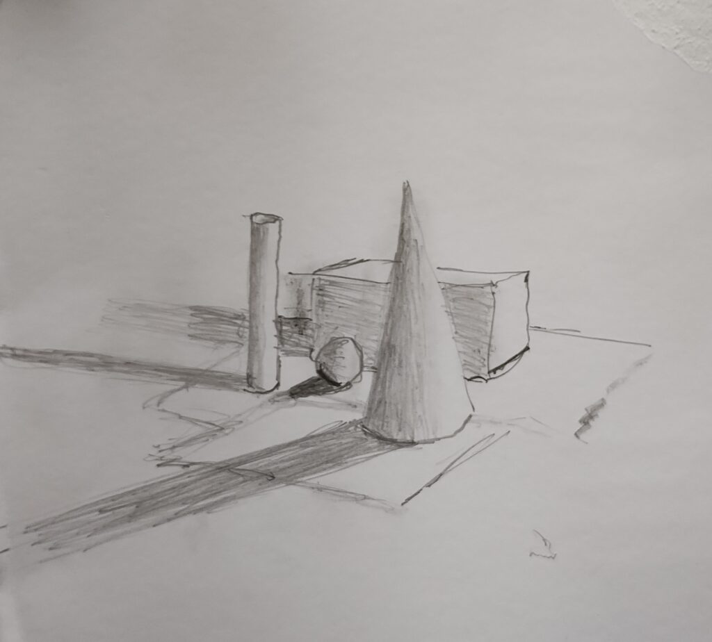
My quick version of the arrangement.

A quick word on pencils. For years I used 5b and 6b most of the time. nowadays I tend to start with 9b. These soft pencils encourage a freer touch and you can also make them very light as well with practice. A textured paper works well for some subjects but smooth is often better for pencils. Pencils are naturally textured.

The cube has defined lines that give us its shape. It makes sense to sketch those lines in, if only to establish the perspective (if you want to stick to that perspective).

The sphere looks like a circle but we can usually see straight away that it is a sphere. Drawing the outline can help you to make it circular rather than some other shape but you run the risk of giving the sphere an edge. If you don’t trust your shape drawing (who does?) then draw the outline but make it as light and sketchy as you can. The sphere optical edges are defined by where it goes out of our line of sight and where the background objects disappear behind it. You could begin to detail the shape by putting in the background objects.

Both the cone and the cylinder are versions of the sphere but with edges. If you chopped the sphere in two, you would have a sphere with a tricky perspective circle, in effect making it a figure with two faces. To indicate the shape better you could make lines that follow or indicate the shape and that would allow our brains to pick up those hints. To get a more nuanced shape definition we use the light which gives us shading and shadow. Tracey put a light on the objects to emphasise both of these. She also told us to make sure that we were constantly looking at what was actually happening with the shade and shadow and not making assumptions about what was happening. When I came to draw the grouping of objects I soon realised that the light source was slightly rounded, exaggerating the way the light radiates out and both the shading and shadows went in different directions for each object. When the close, directed, light was turned off there were multiple shades and shadows from the many lights in the room. Also the object themselves reflect some light onto other things around them.
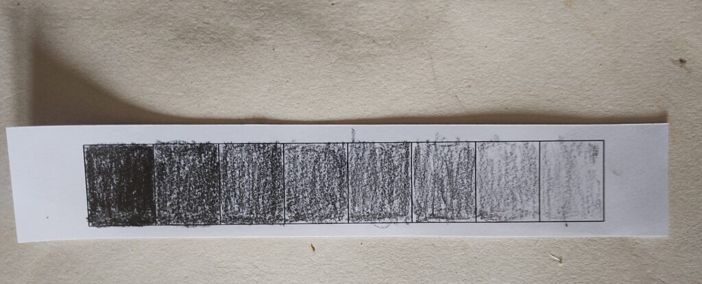
Shading strip. Notice the shadows the strip makes and how exaggerated they are

That of course is the simple bit. Tracey quite rightly had a moan about denigrating art in education, when it is actually a very complex subject with multiple technical and social aspects to it. I’ll now try to set out, briefly, some of the other lessons from the session.

Without getting tied up by it, always try to remember that every object that you draw is a shape like these ones. It will have actual edges, points where it disappears from our view and surfaces which have a shape of their own (concave or convex, facing us, angled to us etc.). Even texture is a set of mini shapes on the surfaces of the object. There will also be perspective.
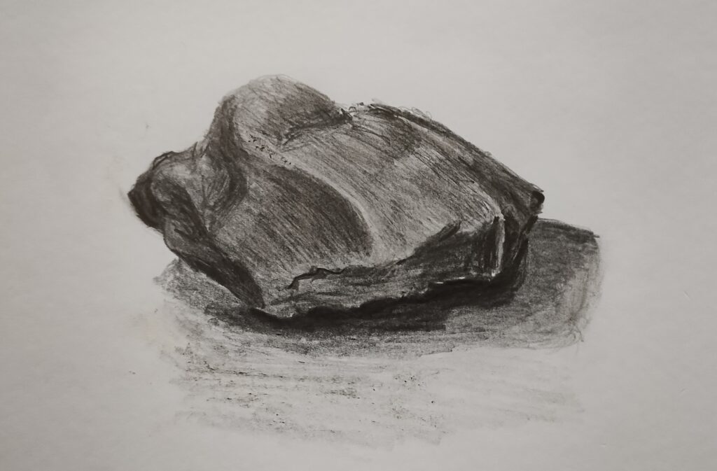
I drew this stone without drawing any edges at all. Just started shading bottom right.

Try to resist getting too caught up with drawing edges on things.

Using the shape information, try to separate the effects of light and shade from the competing shades given by the colours of the object. Tracey gave us a strip of squares to shade from dark to light. If part of the object is light yellow and part dark blue, the shading differences given by the lighting and shape on each colour are likely to be mostly consistent across the colours.

Where objects have colour, the reflected light from them has some colour also. This can affect adjacent objects.

When you are drawing or painting try to make sure that your body, arm and wrist positions allow you as much free, smooth and controllable movement as possible when you are making your marks. I have had shakes and jerks all my life, so have to get the position right and wait for the right moment.

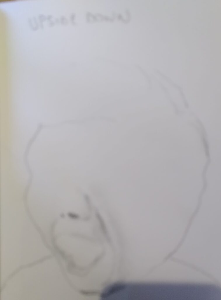
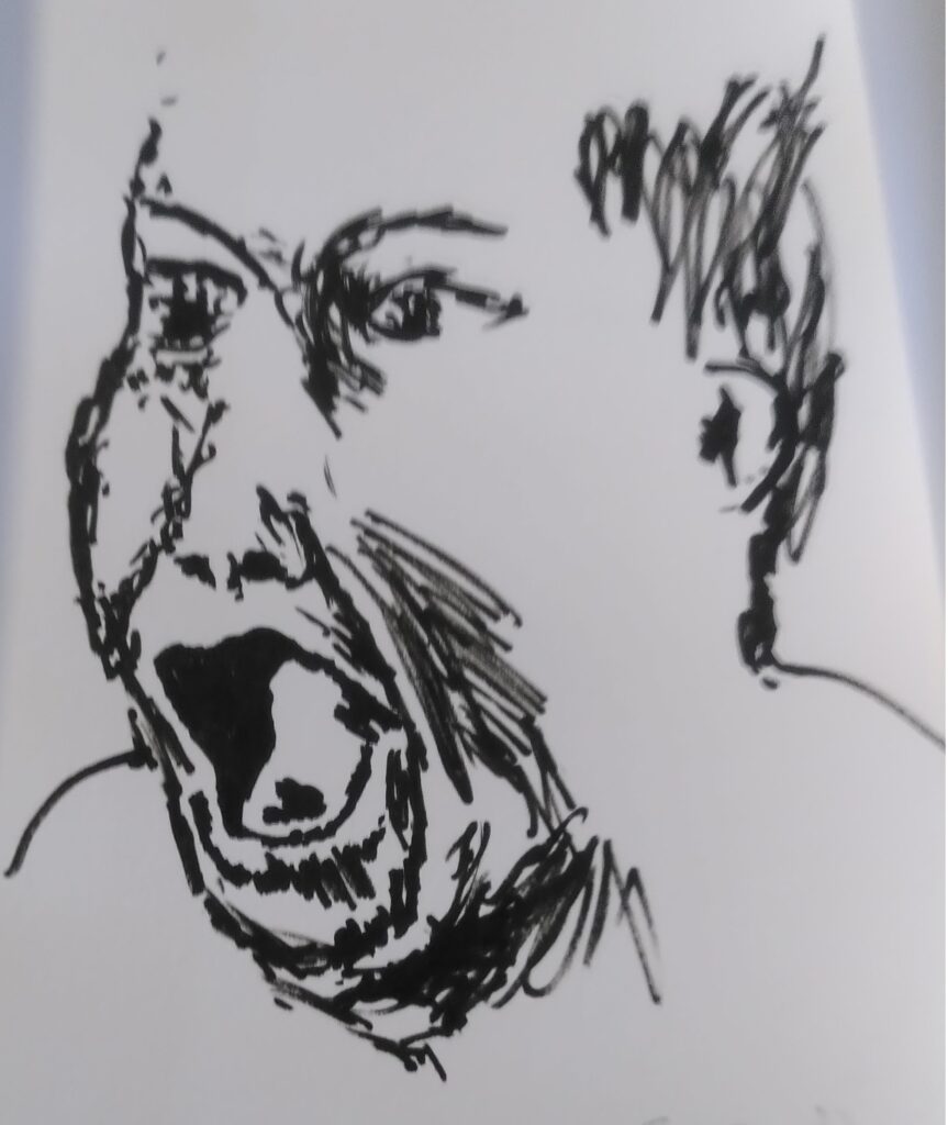
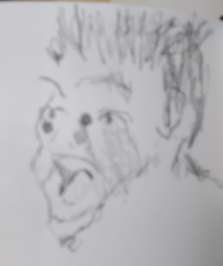
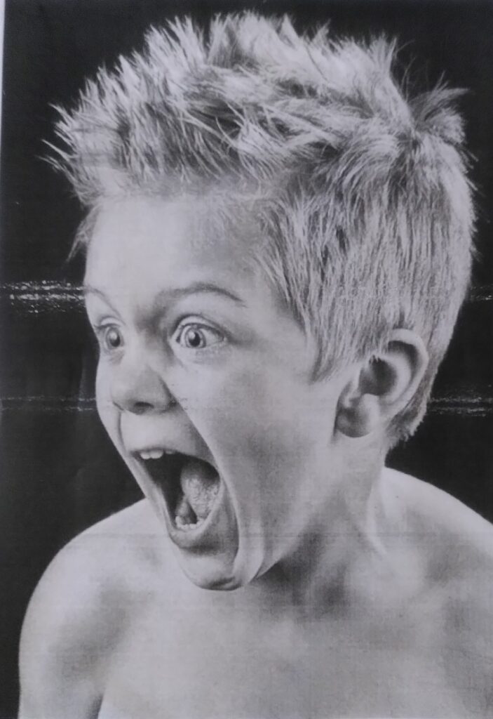
Keep comparing your version with what is in front of you and remembering the basics set out above. Look at what you are producing from further away, as this gives you a better sense of the overall shape. There is a famous experiment where people were given a drawing to copy. If the were made to keep the original drawing upside down they generally made a better job of it because they had less tendency to draw what they thought they saw.

Of course these guidelines are mainly of value if you want to produce a persuasive facsimile. That isn’t the only aim of most pieces of work. It does help to have learned how to imitate things even if your aim is to do something else with them.
Categories
Art

Trying to Simplify Paint and Paper

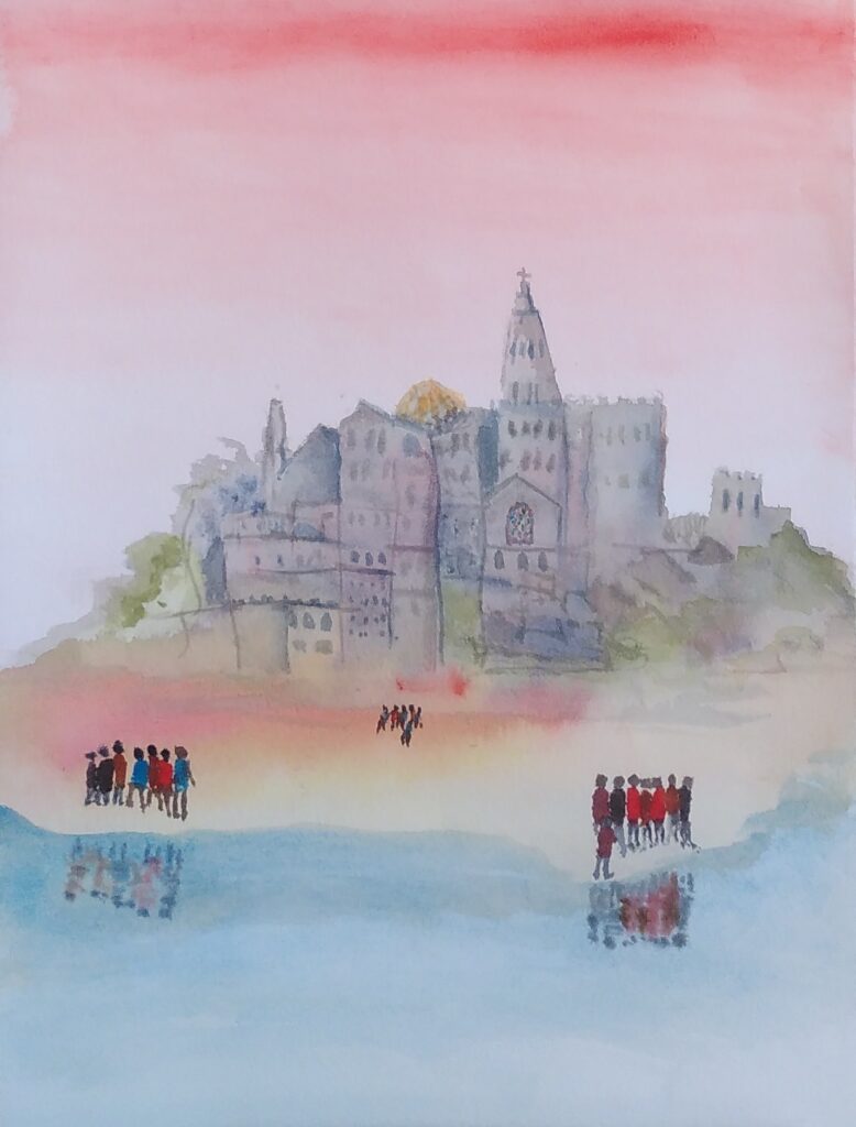
Last night I was at a workshop given by Sarah Moss, on watercolour landscapes including people. The group included those who mostly paint with watercolour and those who rarely do, people who paint in completely different ways and some who have little experience of the more technical aspects of this medium. This is an attempt to explain and simplify things a bit. I’m not going into detail about different sorts of watercolour paint, more the way of application and the papers.

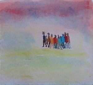
This is what Sarah was getting us to paint (though I managed to miss that and made up my own).

Those of you with experience may realise straight away that this may be better on a slightly smoother paper. It is also painted using a wet on wet technique, which means putting lots of water on the paper and letting the paint flow on the surface.

Sarah said that 200lb paper would be best. Immediately we are into issues that can be confusing, with jargon in the advert or on the pad of paper can be somewhat off-putting. The good news is that Turner and his contemporaries mostly used writing paper to paint on with watercolours. That is because the writing paper of the day was reasonably heavy and had absorbency that took the ink but didn’t spread it around. The other good news is that, once you find a paper that works with your style, you can just buy it on repeat until you want to try a different way of doing things.

One jargon area is weight of the paper. Sarah specified that in lb (lbs), which relates to the, well past retirement date (unless you are American or old like some of us), Pounds and Ounces system. So we already have lb, lbs and pounds for one measure.
Another, more universal, measure is GSM, which is grams per square metre. The trouble is that there is no easy conversion between the two. That is because they measure slightly different things. Both are slightly odd in measuring on a flat scale (e.g. square metres) something that can have a whole range of thicknesses. Then, for a particular thickness there can different densities. Oh dear. So 200lb watercolour paper is usually 425gsm. That is a heavy paper. Because I have it, I used some old hand-made paper that is like card for the workshop. For most uses I would buy the heaviest that you feel you can afford both to buy and to waste. If it is lighter weight you can stretch your paper (wetting it till it expands and taping it down while it dries to make it tighter and less prone to wrinkling) but that is not without its problems, or you can put up with the wrinkling but that just makes the painting harder to control.
People Painting test

Let’s go back to the texture of the paper. This is indicated in various ways. It might be a reference to a particular way paper was made once e.g Bockingford or a manufacturing technique (NOT which has been Cold Pressed or Hot or even Rough). Papers move from smooth through to those that have a quite pronounced 3d texture. Some famous watercolourists use the texture of the paper to give visual texture to the paint. Sarah talked about adding texture with the paint by bleeding (having adjacent areas both wet or removing colour (blotting) from particular areas. She also introduced the idea of denting the paper (with the end of the brush handle) to make the paint pool in those areas. That way you get the effect of different paper textures where you want them, not all over the paper. Textured papers are like the wrinkled paper, there are peaks and troughs and pigment runs into the troughs. There is also more surface area, because of the little bumps, so that can make the paper appear relatively more absorbent. Apart from the little tricks that you pick up, I would get a small amount of each and play with it to see what happens. Then, alongside the weight you can afford, pick the paper that feels like the ones you were most satisfied with.

The final topic here, at least for the moment, is absorbency. Paper is lots of fibres squashed together. The paper often has glue(size) spread over the surface to fill in the ends of fibres that are facing upwards and to make a paper with a more controlled surface texture and absorbency. Some papers have size internally as well. I wouldn’t bother thinking about this too much. Just try experimenting over time, ask people who do it a lot or perhaps you could read up a bit. Just remember that people love to repeat the little they know as, often inappropriate, wise advice (including me of course).

I hope the message has come across to keep trying different things. If it helps, make notes, so you can recreate the successful efforts. I know I had enormous fun playing last night, painting in a way that was different to much that I do normally. I was happy with what I produced and will add it all to my stock of different options when I set out to paint something.

My version

Of course, I had the right paper for the occasion, watercolours in tubes put into a palette that I use all the time, brushes that were of reasonable quality and that I am used to (the main flat brush I used is nearly sixty years old). So keep it simple, try different things in a reasonably organised way and be prepared to ask questions. Mainly have fun.

Categories
Art

Finding Your way to draw and paint

Despite the fact that humans can’t help doing art and have always done so, the world of art is full of rule making and snobbery.

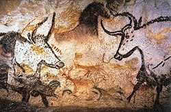
Cave Painting

There is a famous story about Constable, that Reynolds chided him for using such lurid colours in his landscapes, advising using tones related to a valuable old violin. Constable is reputed to have carried the old violin outside and laid it on the grass to demonstrate how mistaken that was. I’m not that fond of Constable’s paintings but that story is an example of rules and how they can lead to stagnation. I’m also pretty sure too that more people have heard of Constable than Reynolds and can picture a painting more readily.

Muted Colours?

The other thing that story inadvertently highlights is the question of who you are painting for. Reynolds was envisaging elite admirers and customers and also that you are painting to fit with an historic story of painting ideals. Constable was painting to suit himself and his view of reality and perhaps also more ordinary viewers of his paintings.

Hidden rules of this sort are everywhere, even in the world of amateur art. Can I suggest that you be aware of them, but also ignore them if they don’t help you to achieve what you want to do? You should paint or draw to please yourself, to keep developing your skills and to sometimes make yourself smile at what you’ve managed to do. It is even better if you can please other people at the same time.

Rule 1 – Don’t paint by numbers, which is a term for drawing lines round everything to establish shape, size and position and then filling in the shapes with colour and or tone.. This is pure snobbery and I suspect has only really existed as a rule since the Impressionists. The Sistine ceiling was painted by sketching in some detail into the wet plaster then following with the paint blocks.

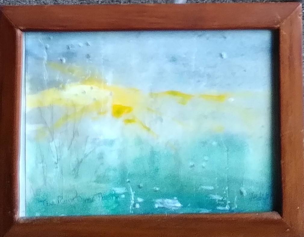
The idea is that you should be able to choose and make a mark without drawing it out in detail and then filling in the blocks. The level of natural skill and vision required to even get close to that is immense. If you can aspire to get nearer, it is enough. Do less drawing and simplify the structure of your paint if you can but don’t think you are a lesser person if more freedom doesn’t work for you. A good example of this is wet on wet watercolour painting (you can do it with acrylic as well to some extent). The opportunities for chaos and disaster are as large as the chances of creating something free and inspiring. Keep trying though, as you may get a pleasant surprise. Here is one of a sun going down seen through a window in the rain. I did it as a sketch for another painting. I thought it had just gone out of control but later saw a good bit within it and over-painted a couple of unwanted marks.

Incidentally there is a halfway house in watercolour between blocks of pure colour and wet on wet. Because of its transparency, if you start light, you can gradually add darker layers over the top. If you do it reasonably quickly and use you brush in the right way, you can activate some of the pigment in the lower layer to produce subtler gradations like you can get with wet on wet. You can also brush water onto the relevant areas of the lower layer, to activate the pigment in those areas before you add the higher layer.

Rule 2 – Develop your own style and stick to it. Sadly this is sometimes necessary if you want to have a loyal customer base. Galleries particularly like artists to do this. It is good to try to individualise your work but it shouldn’t be a shackle for you, holding you back from invention and creativity.

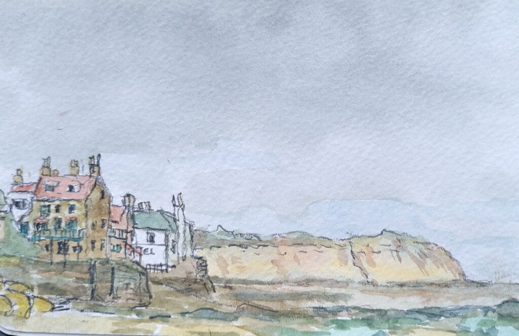
Rule 3 – Paint big. This attitude pervades in a lot of art. Anyone who went to the recent Turner Prize exhibition in Bradford will have seen this in action. If Turner had tried to exhibit the beautiful, tiny watercolours that are held in the National Gallery of Scotland collection, he wouldn’t stand a chance. Paint/draw/collage whatever size and with whichever medium you can make work and that achieves what you want to achieve. It is nice if you can show respect for whatever subject you have chosen too. Not a patch on Turner, but this one of Robin Hoods Bay is only 9cmx14cm and pleases me.

Robin Hoods Bay

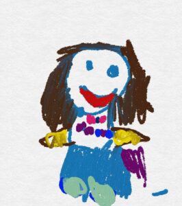
Don’t mix mediums. To some extent this is practical. Oil paint doesn’t mix well with other mediums. Modern paints are now much more flexible. Surprisingly effective results can be obtained by mixing opaque and transparent mediums, for instance. Read about the limitations and abilities of the mediums and methods but also carry out your own experiments. Scraps of paper allow you to test something before you put it on your work. Give yourself freedom to try out different ways of making marks, with different tools and materials. Enjoy playing like that child’s drawing at the top.

There is a term applied to art, that is often used in quite different ways, which is ‘artistic license’. I’m not very fond of the term, as it implies it is something used only by artists and some people see it as akin to lying. When we look at anything, all of us are able to concentrate on what pleases us and ignore what does so less, like the cars roaring past an attractive scene and their smell and noise. When things are committed to memory we are even more selective. When we paint or draw we are always painting or drawing emotions to some extent. We are just making a hard copy of our normally selective vision and memory.

That is enough rules for today. Be aware of the rules and treat them as possible helpful guidelines but don’t let them hold you back from expressing yourself. Try to learn the little tricks that allow you to achieve a more fluid and lively look with improved textural feel. Recognise when to pause something that is going out of control and when to quickly remove some of the paint with a rag to make it easy to try it again later.

Enjoy watching and experimenting. Don’t tear things up and instead look at them later and see whether they can be rescued or which bits worked better and can provide a lesson for later.

Categories
Art

Patience, skill transfer and what fits

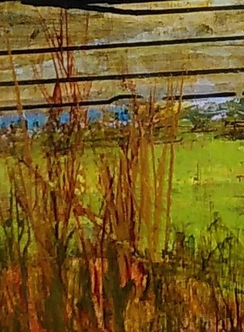
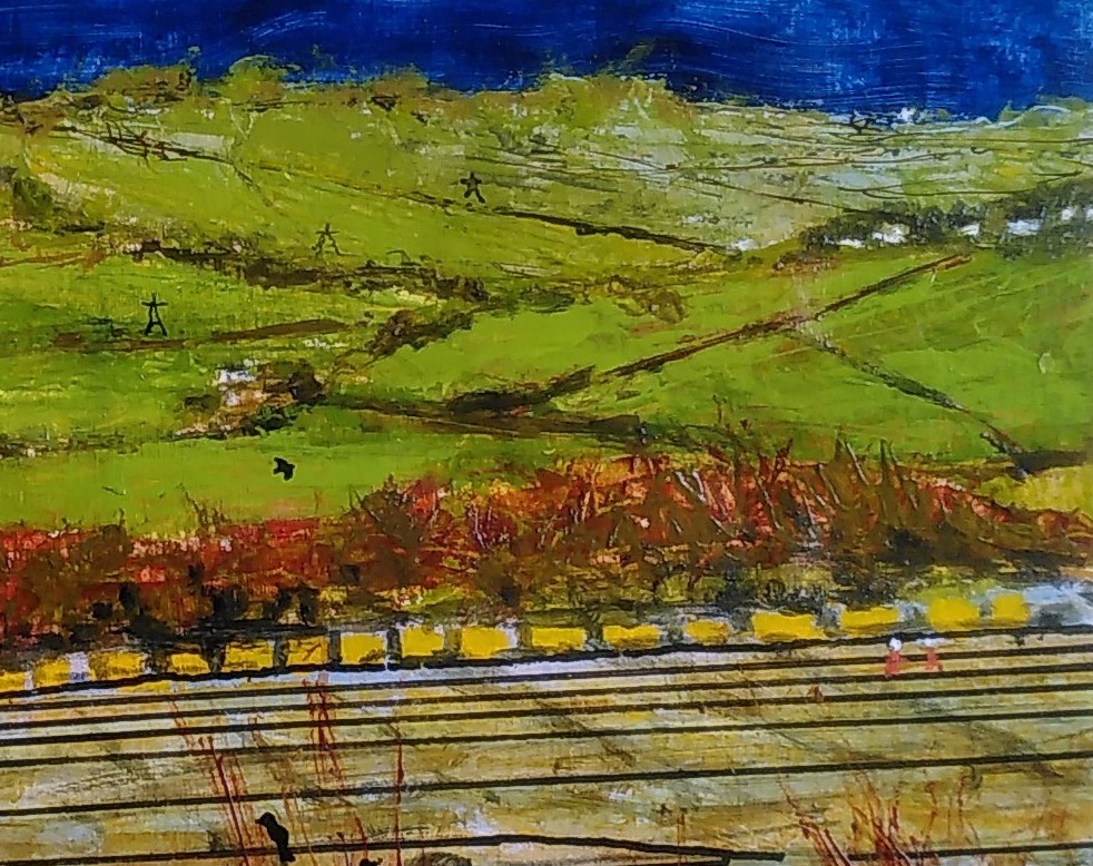
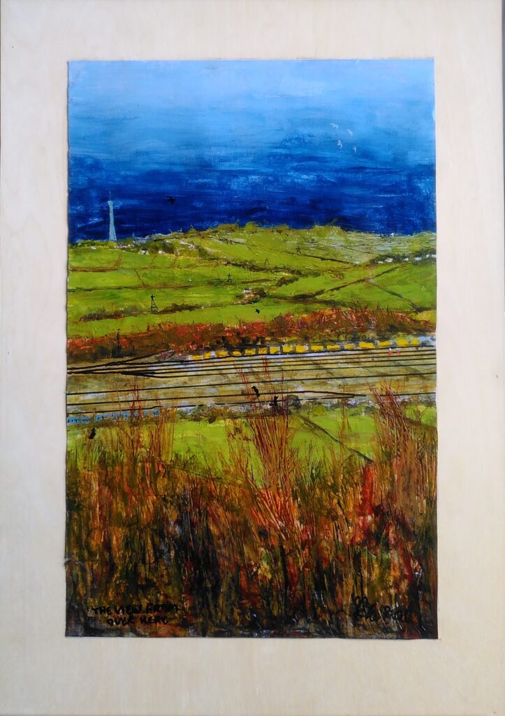
I’ve just had a bit of a bad few days with one painting. It was going well, blending skills I have recently learnt with older ones and trying out some new ideas. I have learnt to add visual complexity and detail using a palette knife. That is particularly useful because of my tendency to shake and twitch (see the sudden bend in the rail line).

That close-up also shows that I have not always learnt to overcome the difficulties of sequencing in painting, with the rail line going over some of the foreground vegetation.

The rail lines and other similar details are another problem for me and the shakes, as I seem to get worse if I try to measure and use a ruler. I’ve learnt ways of relaxing before trying to make marks to reduce the shake and I’ve realised that we only really notice detail in particular situations, such as those rail lines and even then they don’t stand out in larger numbers

I was experimenting with various things to overcome some of these difficulties and have been trying acrylic pens, which seem to work except that they are a bit inconsistent for me. This is where another persistent problem came into play – failure to concentrate. In that close-up above there are crows and pylons (I love Pylons and wires). I didn’t have a black acrylic pen, so grabbed the finest black marker I could find and it worked, until later when I over hastily put a layer of matte varnish on. Without me noticing at first, the varnish simply smeared and wiped out all that detail I had put on. Arrgh.

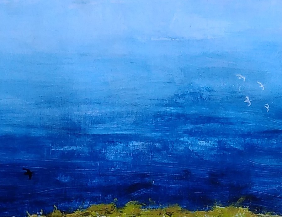
This is where that other skill that age has taught me comes in – patience. Instead of having a minor tantrum and tearing it all up, I bought some acrylic ink and tried some experiments (on a spare piece of paper this time) using my ancient dip pen. I hated dip pens when we used them at school but this seems to have worked reasonably well. I even went as far as to add some gulls in white.

Even so I then reverted to type when it came to sticking the picture on to a cradled board support. For all my my measuring and marking, I manage to stick it down upside down and slightly skewed. Time for a break and some of that patience and persistence. Using my newly learned skills with palette knives and scrapers, I came back and carefully manged to remove it from the board with only two minor tears. Here is the corrected result.

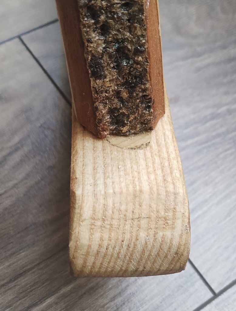
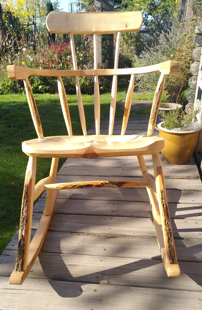
Of course these messages also apply to everything you do. Even after several years of chair making my brain would go AWOL but there are always remedies. This is a detail from my last chair showing that I had to take it apart, fill in the hole in the wrong place and drill it in the right place. That is still probably the chair that most captures my style, warts and all.

Have fun and keep at it.

Categories
Art

Failing to Portrait

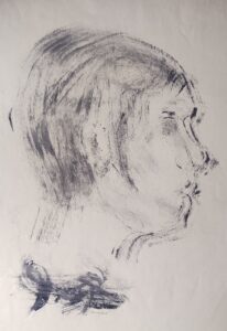
Of all the art works I’ve done over the last 70 years, the ones I’ve had least satisfaction with are portraits. Thankfully when I think of all the art I’ve looked at there are very few portraits by other artists that really please me as well. The Uffizi gallery with all those virgin and child, cherub filled pieces is by far the least enjoyable gallery I have ever been in. That’s personal of course. I am not even very keen on photographs of people.

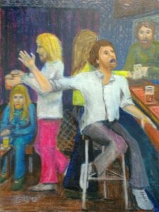
Oddly an early pencil sketch I did of my grandad, really captured the subject and may still be adorning some wall up in Barrow-in-Furness. On the other hand I have been failing to get the scene below right for at least 20 years, mainly because of the singer’s mouth. In general the difficulty of portraits varies from side profile old men through a scale to full body young child. Animals seem to be easier, though horses are less so.

While this one from 1967, done with shoe brush and polish still works better for me.

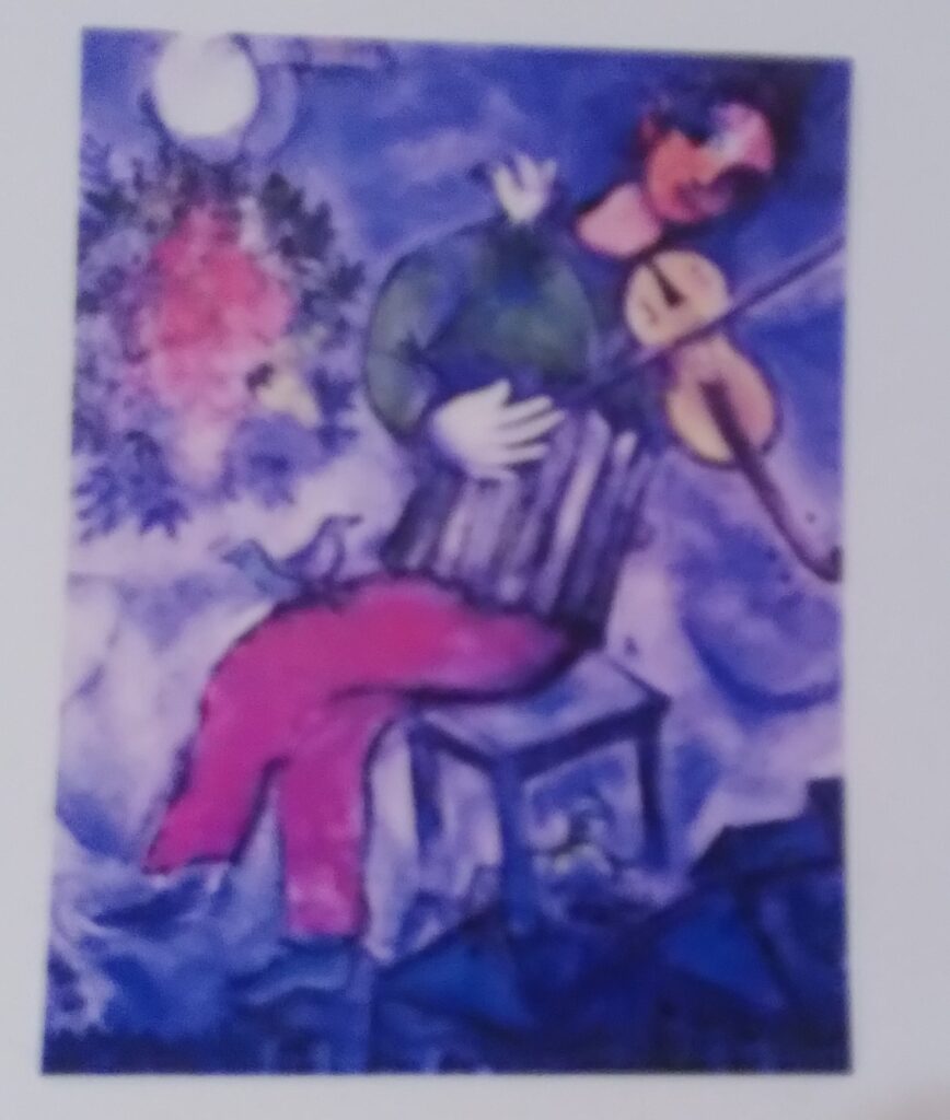
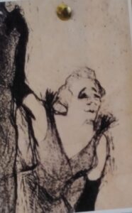
Some people are such natural mark makers that they can capture people with real economy (Hockney, Daumier). Other artists chose a different tack. They concentrate on capturing character, movement and a sense of life. For me that is usually more successful to look at than more literal works. Below are some of the pictures I have on my wall, because they inspire me without making me a copyist.

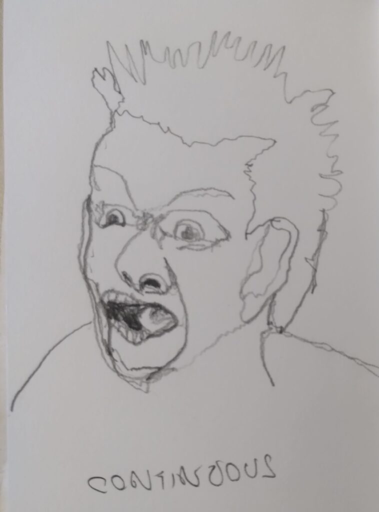
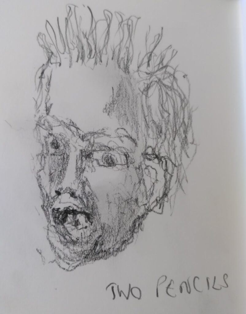
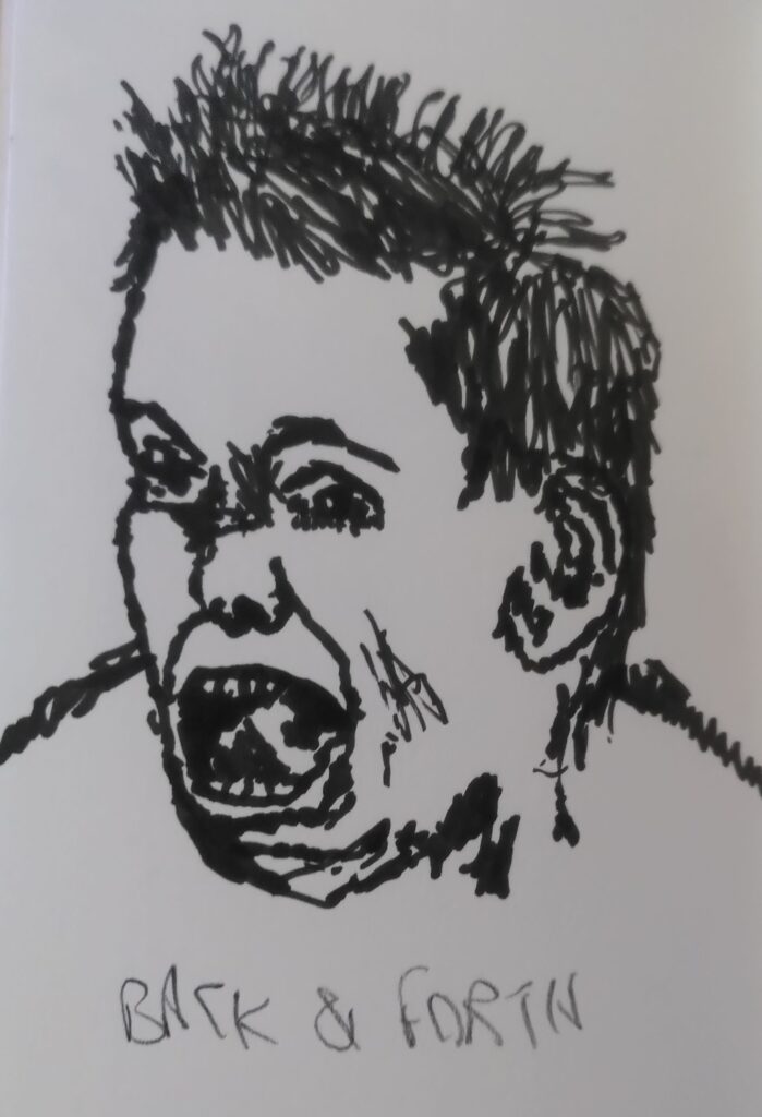
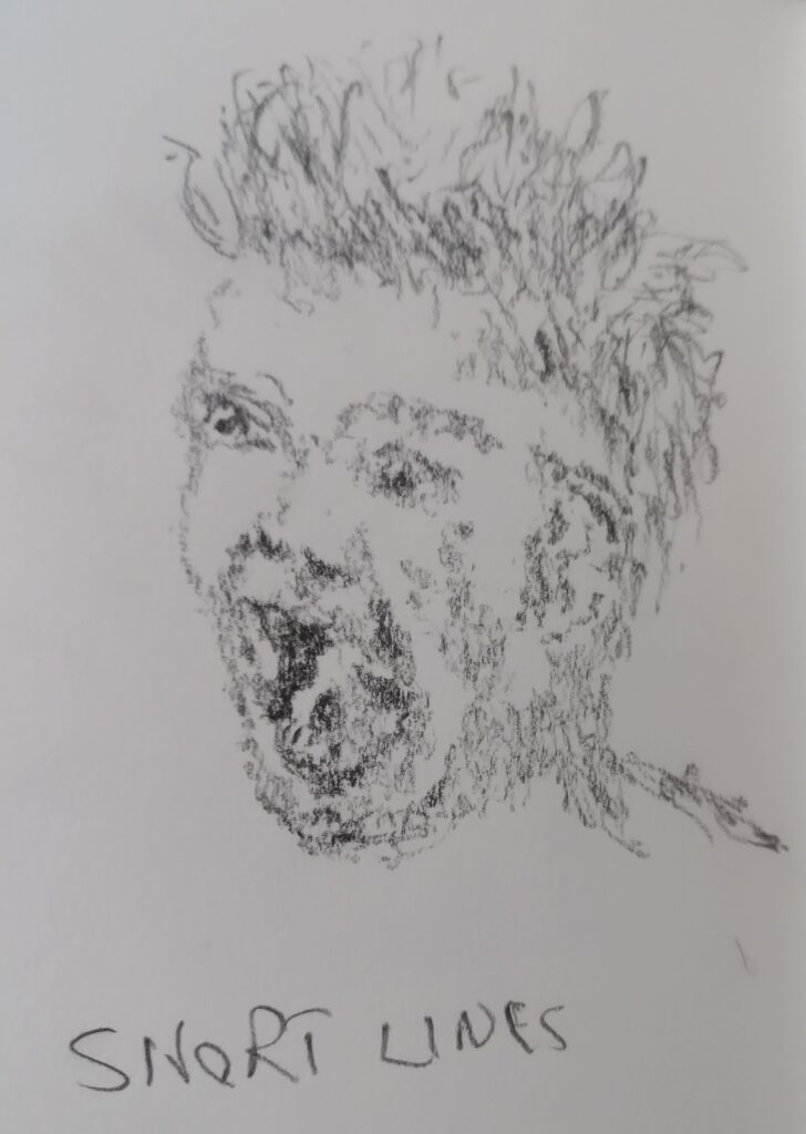
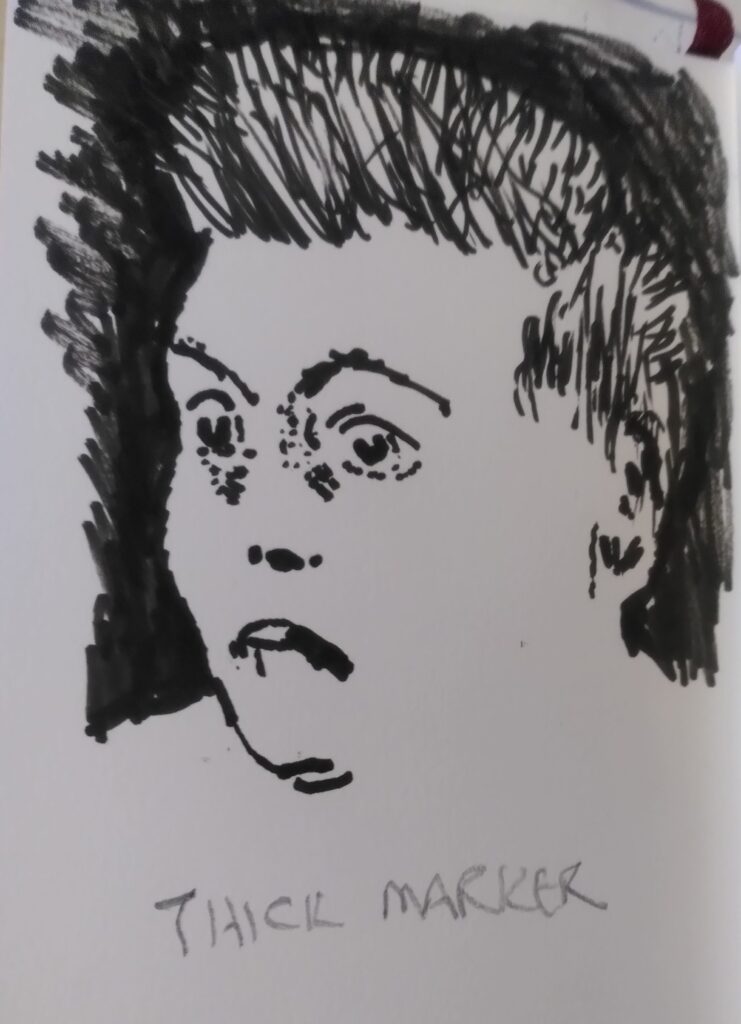
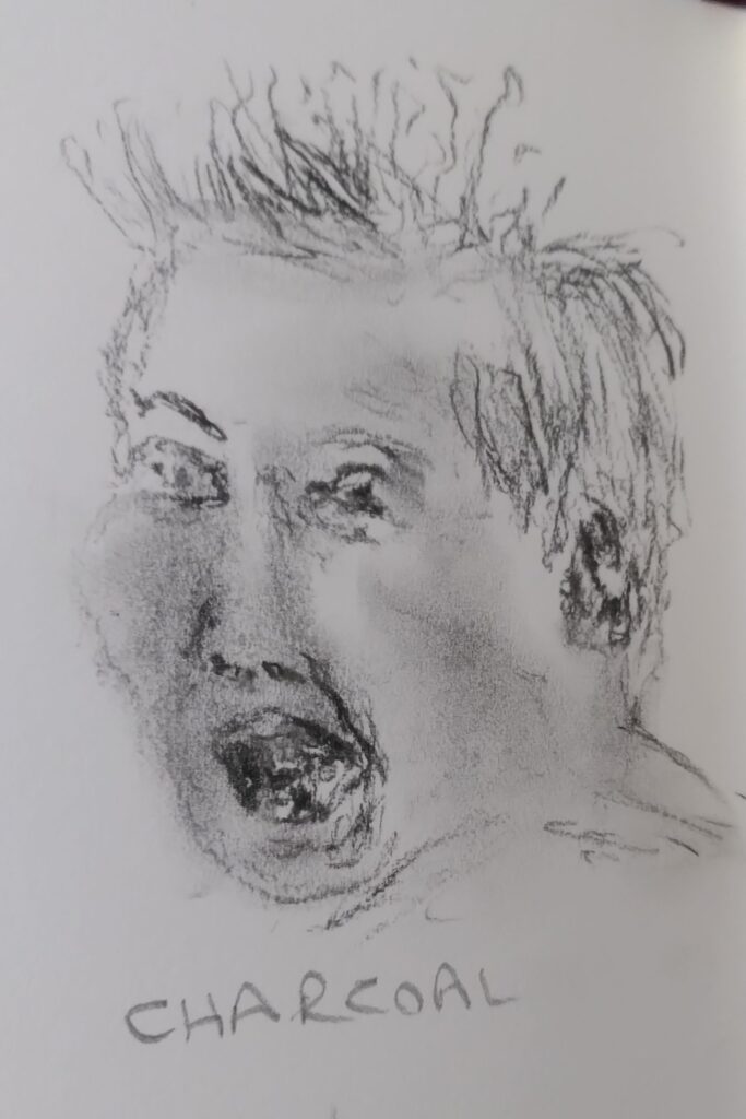
Last night we did an exercise, thanks Wayne, doing 6 minute sketches,using different techniques, from B&W photos. I used the same photo each time, which is at the bottom. I think I’ve got the order last from first at the top. There was also a last one using the wrong hand, but I excused myself that one. For me the charcoal one struck me, as it started out well, with the hair, but the more I got into delicate detail the more my shaky hands betrayed me.

Categories
Art

Pippa Ashworth Workshop

Yesterday I was at a Contemporary Landscape Painting workshop with Pippa. It was very stimulating, so I thought I’d pass the basics on.

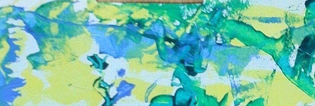
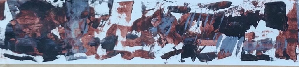
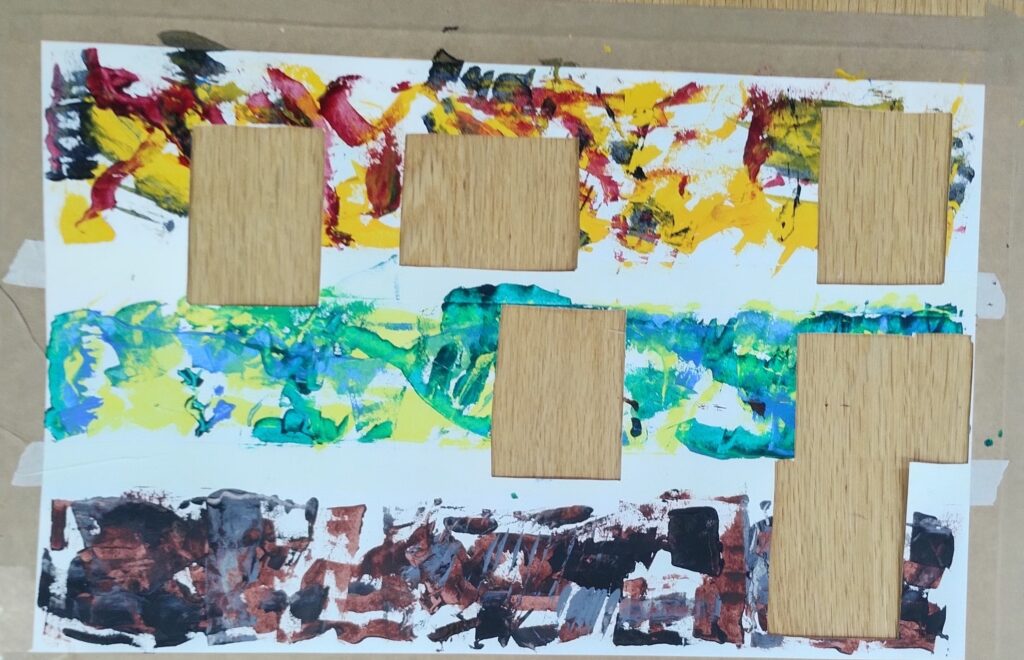
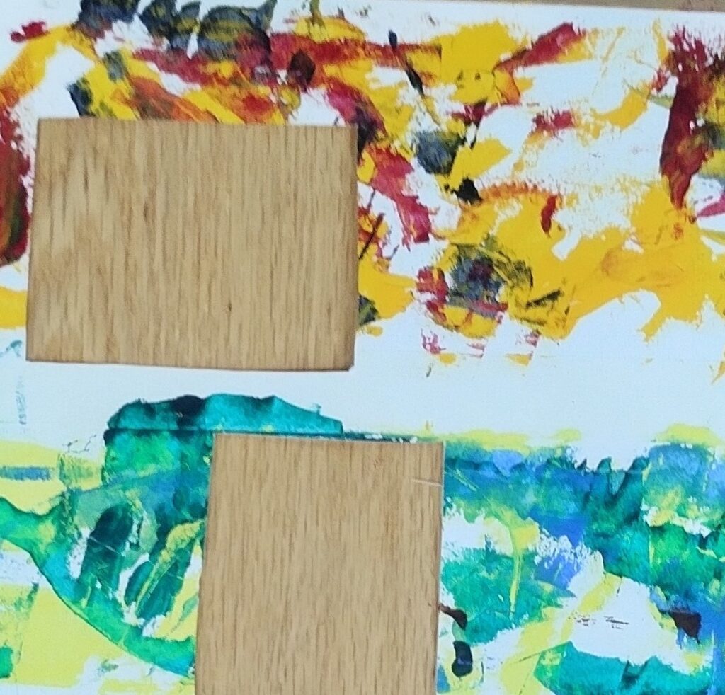
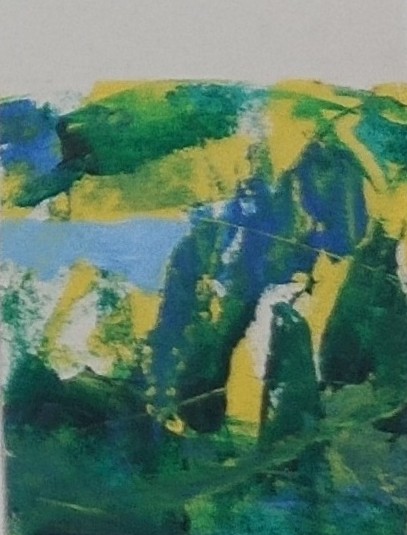
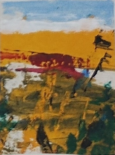
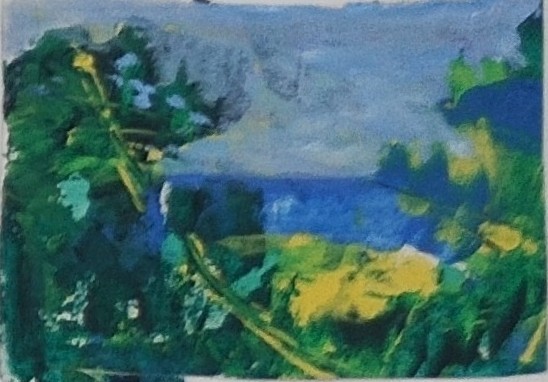
We started by dividing a good sized piece of reasonably heavyweight cartridge paper into three rows and then making marks across each row with palette knife and undiluted acrylic paint. Desperately not thinking of landscapes we used a dark, medium and light colour in each, perhaps with a warm or cold colour relationship.

Make sure to leave a good quantity of white paper. On one row at least the dark should be black. The marks should overflow to give colour and texture subtleties. There should be slightly stronger areas of pigment and others could be almost scraped off. Don’t get too fussy.

Next take a small mount cut out and keep laying it over the paper to see if any interesting shapes or images emerge. You can twist the mount at whatever angle works. Pick as many images as you fancy playing with. They can’t overlap, as the next task is to cut them out and stick them to a sheet of paper to work on. In those bits you can think about landscape at last. You can paint over any bits that don’t work and add detail that adds more shape, distance and texture.

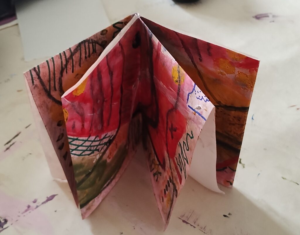
Lastly we did some larger (but still small for this exercise) pictures using the same stages on each piece of paper – Making flat marks in three colour shades, with different strengths, overlaps and textures. Doing it reminded me of Heather Burton’s advice to block in shapes quickly in flat colour at the start of a palette knife piece and the abstract session where we folded a paper that we had worked on to highlight different sections and stimulate new ideas.

The exercise aimed to give more liveliness to compositions. Using flat acrylics allows you to add layers of subtlety and detail afterwards.

Apparently in another workshop Pippa gave people, when working from a photo or someone else’s painting, the advice turn the original over for the last third of the time working on it. That way you turn it into your own work but also start looking at the painting in the way you need to better do your own original work. Sound advice.

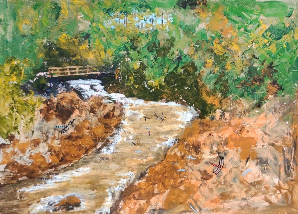
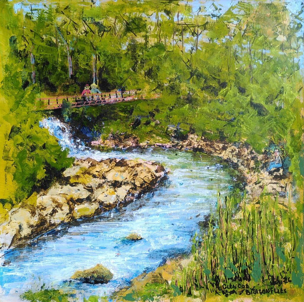
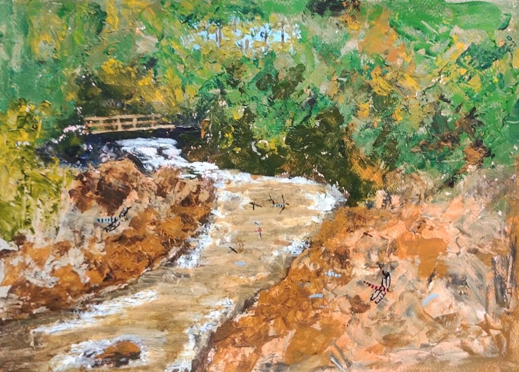
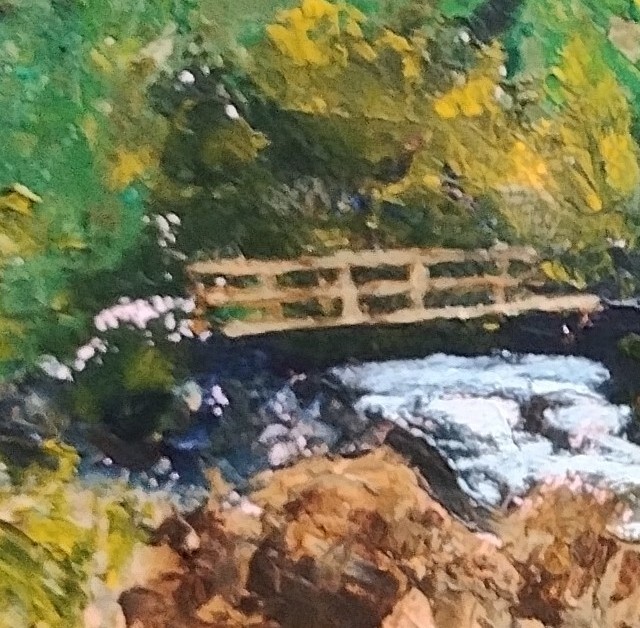
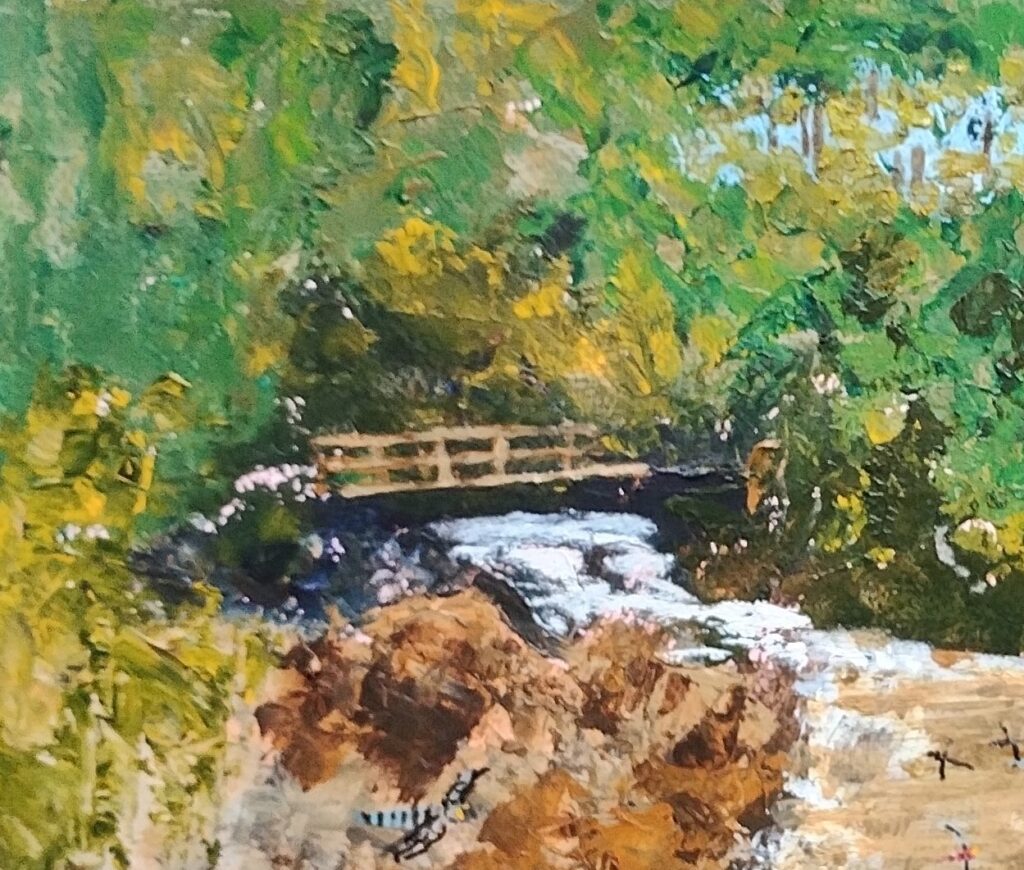
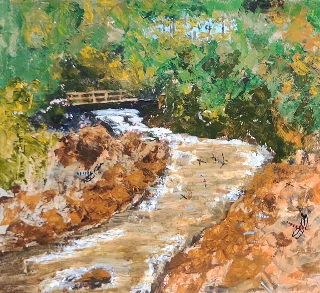
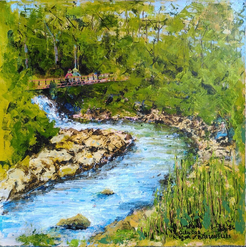
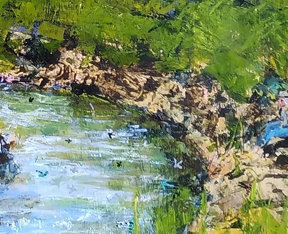
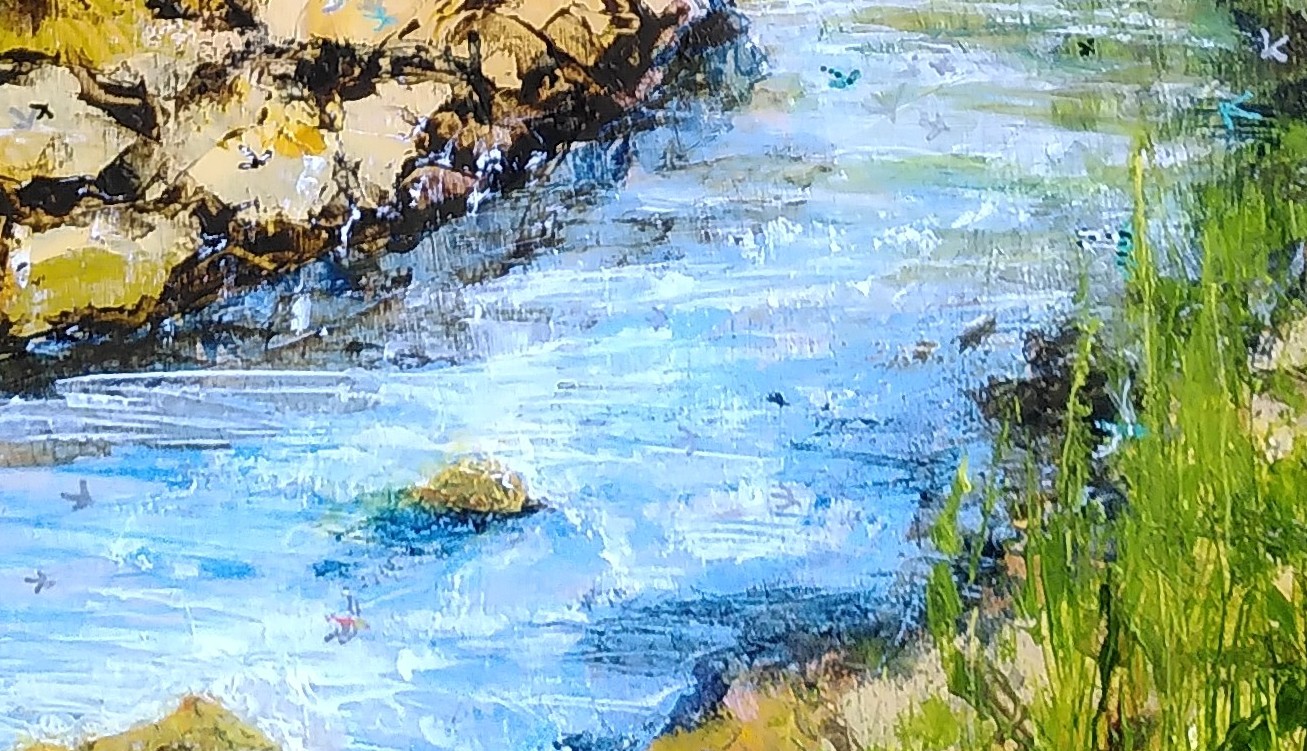
This approach allowed me to free up a painting I’d been struggling with, trying to capture a day at Glencoe’s Signal Rock site, when there were many dragonflies. Not perfect but improved. Thanks again Pippa.

Categories
Art

Art that Evolves

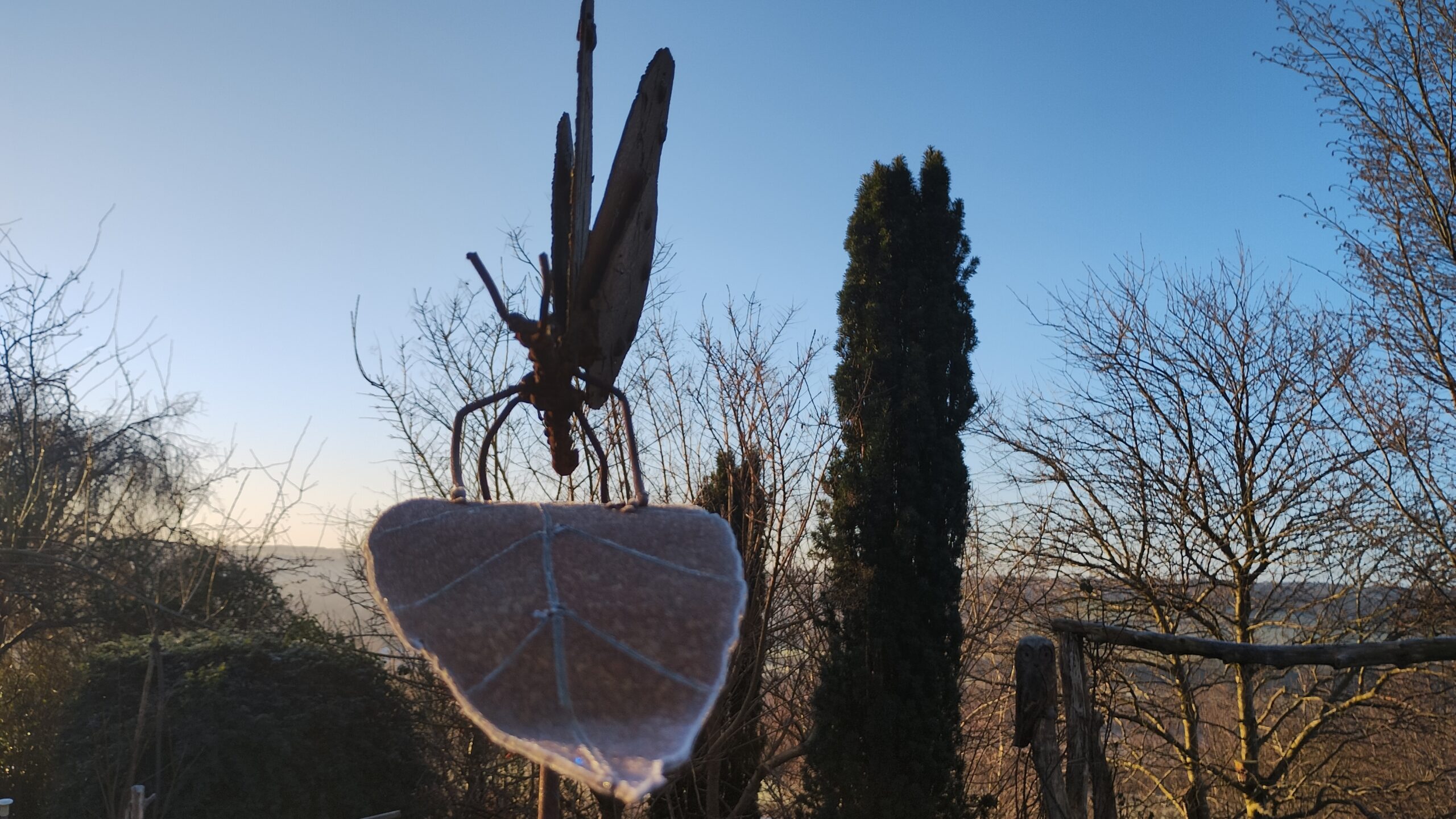
I had a discussion the other day about the fact that people often pay good money to have something look like it has rusted with age, the fashionable use of Corten steel being an example. I have a love of letting sculptures develop as they will over the years, with minimal interference and restoration. Wooden ones sometimes need more attention but I love the way the metal ones change. Different metals have different characteristics and alloying and oxidisation processes affect that. I think the sculptures have a better feel and texture if left to evolve, with minimal interference, though lately I have been using a weak oil paint and linseed oil mix on parts of them to slow and subtly alter the changes.

Here are some examples.

Categories
Art

A Host of Metal Butterflies

I’ve just hired time in David Mayne’s sculpture studio to realise a dream I didn’t really know I had. I’ve often told visitors to Yorkshire Sculpture Park about people metaphorically patting me on the head for sculpture I made when I was 16 and then looking around at the professional SCULPTURES. I couldn’t see how I could move into that world and moved on.

Sculpture by a sixteen year old

After making a few metal sculptures in recent years, I had a vision of making up a group and decided to indulge myself.

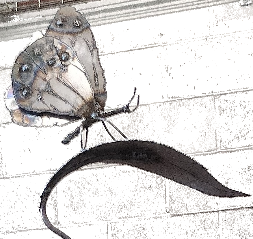
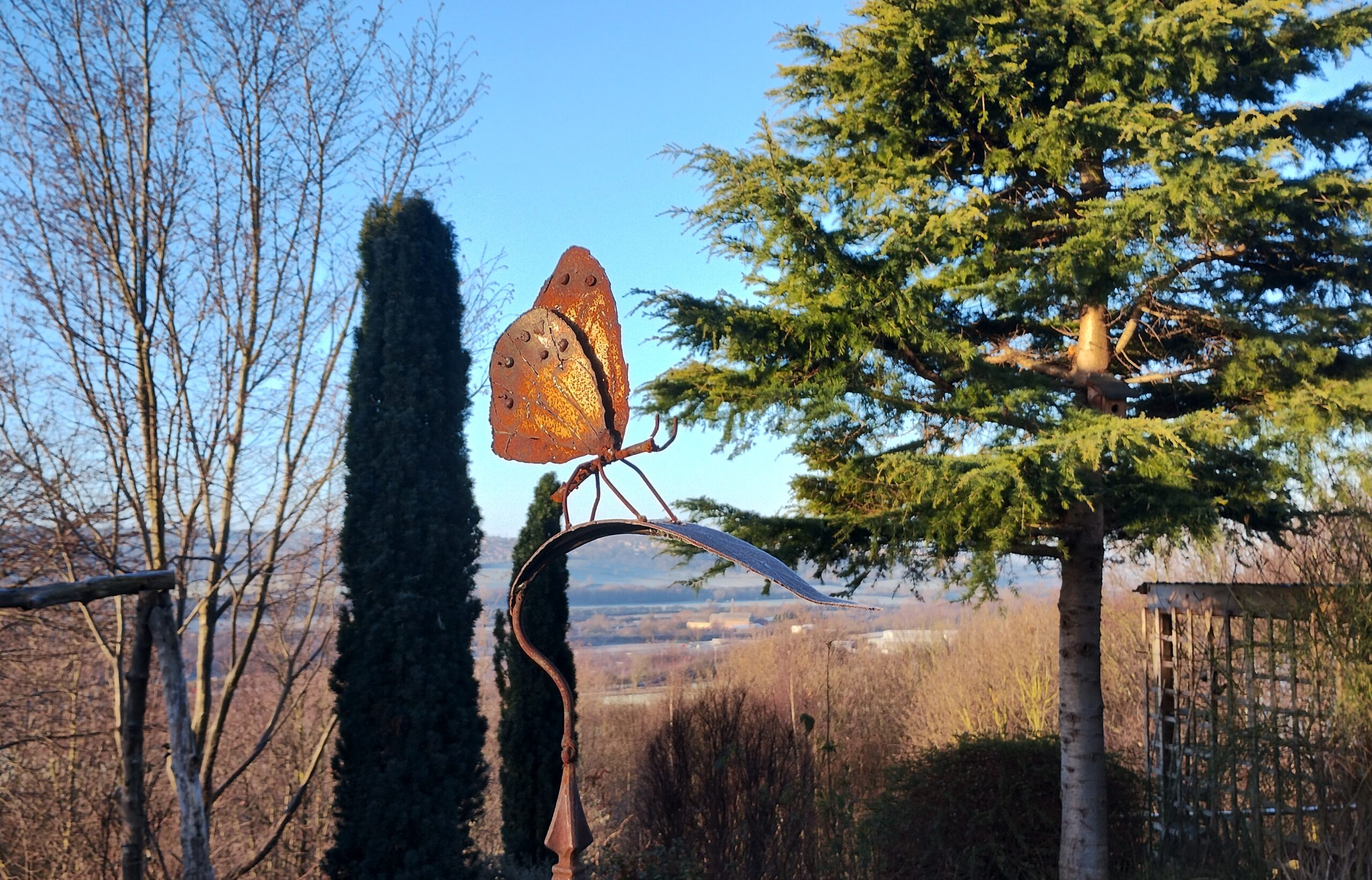
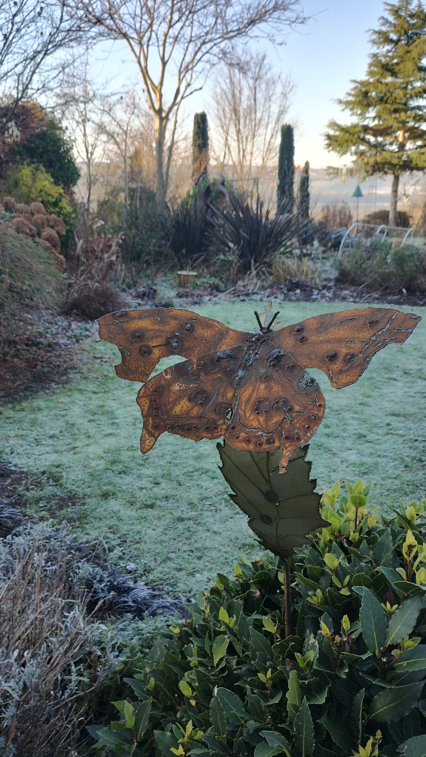
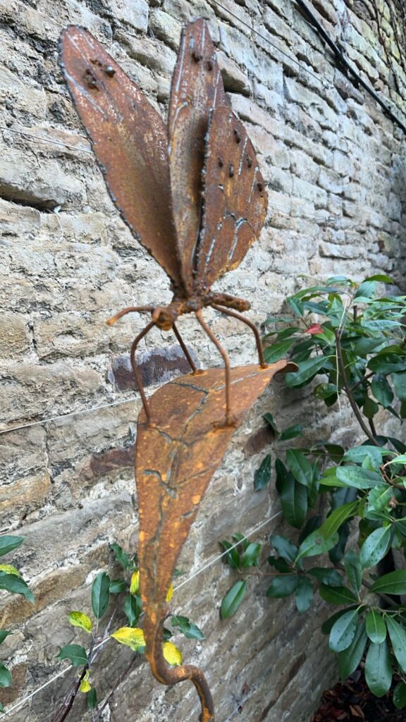
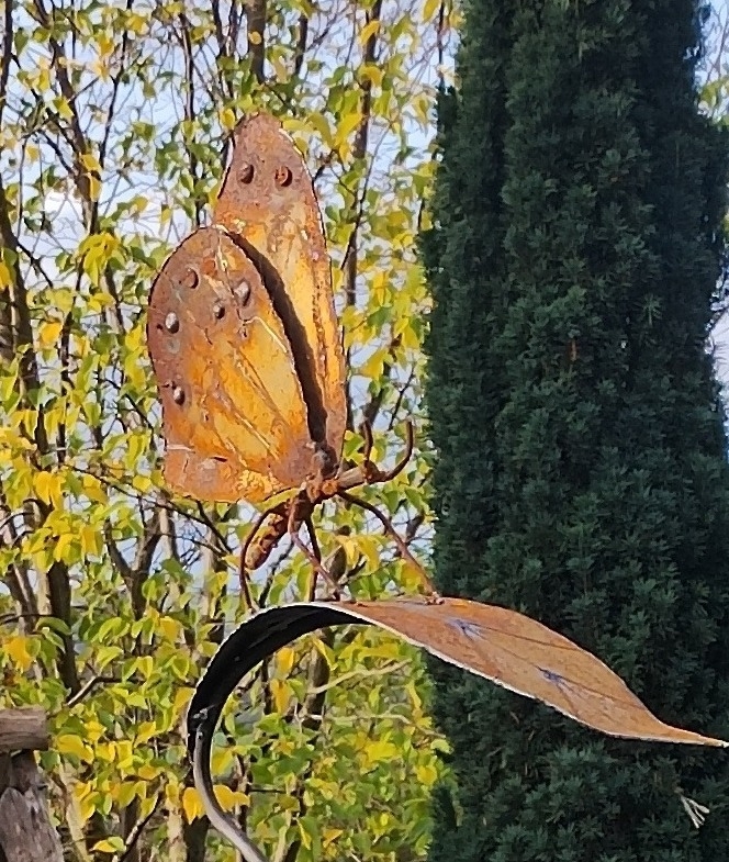
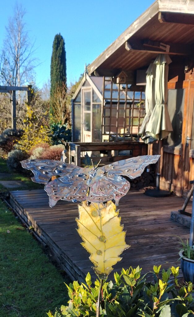
I’d recently made two butterflies based on the Ringlet and they seemed to please others as well. One of them was left by its new owner to quietly oxidise by itself which will look more like the Ringlet, which is brown. After installing the second and looking at the way the light worked on it, I decided to experiment with putting a weak mixture of yellow ochre and linseed oil on the butterfly and sap green in the case of the leaf. That has worked well, changing the subtle effects of the heat worked markings and slowing the ageing process but not stopping it and not having an enameled surface that will later flake.

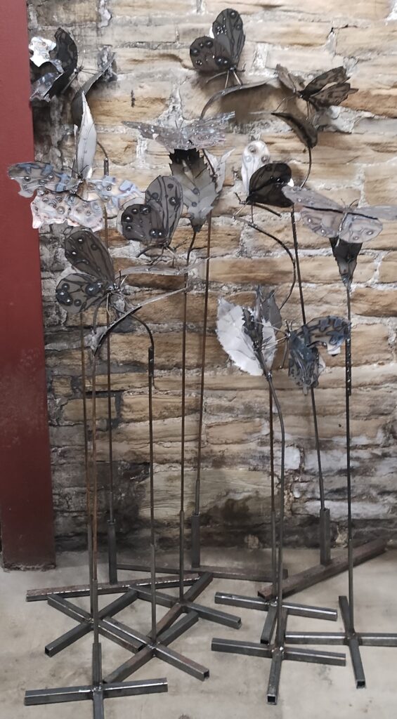
I decided to do a set of ten based on the Ringlet again and also the Comma. Here is the result grouped in the corridor at The Sculpture Lounge.

The stands allow them to be displayed on a flat surface, where they can be bolted down if required. Equally they can stand on soil and the rod goes through the stand to anchor further into the soil. Tent pegs can also be used with the cross pieces (we live in a windy garden).

Here is a shorter one in the flower bed by our kitchen. The leaf is temporarily yellow with some oil paint and the sun. It will slowly change colour.

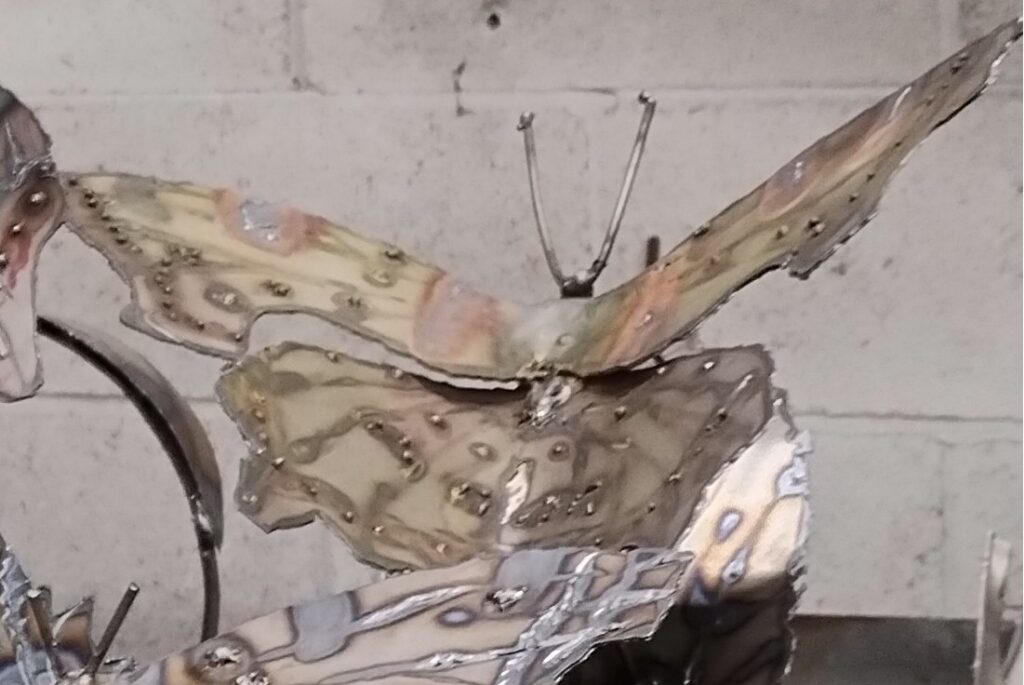
Unlike the Ringlet, the Comma is quite bright yellow or orange on the upper side of the wing. The lower side is dull and brown, so that they look like a dead leaf when the wings are closed. Clever eh? I have started patination experiments on the same lines to give a gentle aging and earlier colour indication.

Categories
Art

Permission to Play Painting

Angela at the Shelley Art Group I go to said the other day that we should enjoy it when we work on something. Very wise. This when everyone else was painting a bit like Monet, while I just messed about. Previously, I’ve tended to expect to produce a finished product when I start painting or drawing. When it doesn’t work out right, I would get annoyed with myself.

Over the years the huge number of times I’ve been out sketching, often in public, have helped me relax more. Age and experience have probably helped too. Sometimes I even produce things that people really like.

Angela isn’t the only one who has recently helped me enjoy it more. When we were doing a session on abstract art there was a tip about folding up what you produce, snipping it and looking it from different perspectives. Now I’ve also got used to playing with palette knives and raw paint often mixed on the picture, that has also allowed me to take a more relaxed approach.

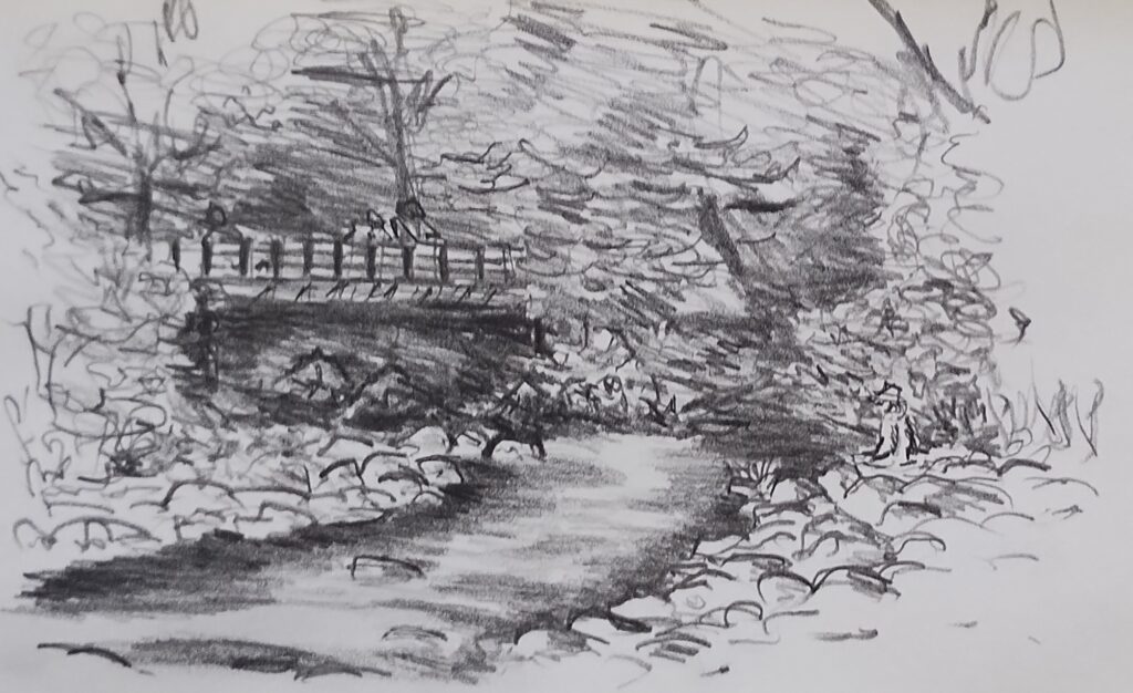
So when I wanted to paint a picture of Ruth sitting by the Coe river, as in Glencoe, from a sketch done when there were masses of dragonflies about, I started playing with both the picture and with different ways of doing dragonflies. I fully expected it to be haphazard, scruffy and throwaway. As it evolved I kept trying new ideas, Some work better, some don’t. Taking photos and cropping them allowed me to look at different compositional ideas and highlight what worked.

The penultimate one there was where I started on a more finalised version. Adding a bit of sky peeping through the foliage told me to do a layer of sky first and then trunks and foliage on top. On the right I wanted to make the foliage stand out as nearer to give more depth. I’ve got to add three people in there too. It kept me going for a while, but kept looking at the sketch, thinking I was not really making any improvement. Finally I reached a point where it had achieved what I set out to do. It adds something to the sketch but I still probably prefer the sketch overall. It does include the hint of dragonflies for the close observer too.

If you are playing with acrylics, particularly with a palette knife, you can use cartridge paper or heavy grade lining paper but put a ground coat on beforehand, as it helps the paint move. This tip I owe to Julie and it helps make the acrylics behave more like oils, rather than the watercolour-like method used by Anthony Barrow. I am in the habit of using white gesso mixed with a touch of red for some reason.

Where I had little hope that I could manage it with my skill set, I now think I may be able to have another go using what I’ve learned. I may have accidentally produced a bit of a Monet as well.

Categories
Art

Art the Early Days

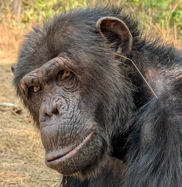
Chimp keeping up with the craze for grass in the ear decoration

That picture is serious. Scientists have discovered that chimps adopt self decoration fads and crazes like grass in the ear.

This first bit of our art history covers a nice vague stretch from ‘the beginning’ to some time over three thousand years ago. As the latest indications are that hominids and probably Home Sapiens have been making tools since around 2.7 million years ago, that is a long time. Indications are also that different types of hominids overlapped, and in some cases, interbred for a lot longer than previously thought, so the history isn’t limited to Homo Sapiens.

Those early tools were made for over 300,000 years in the area around Kenya ( even since I first wrote this the date has been put back further). That means that there was a consistent culture passing on ideas and skills. As animals use gestures props to impress others, it is highly likely that humanoid groups did the same. Unfortunately evidence is slim. Apart from rare preservation of specimens (like Ötzi, the Alpine hunter preserved in ice from around 5,000 years ago), most artifacts made by early people are hard to find. The most commonly preserved things are hard materials like bone, stone and metal. Metal items particularly can be associated with richer individuals. Even large objects, such as canoes, are rare. The earliest so far, 10,000 years ago, is quite likely not the first. Items used by everyday people may not be as long lasting.

The earliest known musical instrument is a flute from around 50,000 years ago but even before that there may have been less robust noise makers and alongside that people will have vocalised and danced. They will almost certainly also have decorated themselves in some way.

In Australia indigenous art dates back beyond 20,000 years and that is from a people who had to migrate over millennia before they got to Australia. Discoveries are still being made using better dating techniques and both in Australia and Indonesia it is thought that examples may date from over 50,000 years ago.

When talking to people about art, I often mischieviosly refer to larger artworks and buildings as Totalitarian art. By this I mean work where someone has so much power and ego that they can commision art that is grandiose. Even today bigger scale art is given more respect than that of more modest size. Unfortunately people often admire this sort of art without thinking too much about the conditions involved in its production. I think all forms of craft and art have value. Some just grab you visually or emotionally and this effect varies from person to person. Some have more intellectual content or more subtle emotional effect than others and these often benefit from more study. No matter what the artist puts into the work, or intends us to think about it, it can sometimes be completely at odds with what people take from it. Interpretation is a personal and difficult thing. The further back in time we go, and the further from our own cultural assumptions, the more we need to take care before judging the work.

This post is a work in progress and I will add some visual examples of work and more detailed discussion to it over time.

Below is a list of selected early artifacts by date. The obvious, non building, art is in bold, but there will be art in later buildings, such as Knossos.

When (years ago 2025)WhatWhere
2,750,000Earliest stone tools, continous 300,000 year useKenya
2,700,000Neanderthal fossilsUK
1,500,000Bone toolsTanzania
500,000Shell JewelryMorocco
300,000Homo Sapiens, oldest currently known remainsMorocco
120,000Fur and Hide clothingMorocco
73,000Abstract crayon drawingSouth Africa
52,000Rock artIndonesia
50,000Bone FluteGermany
40,000Venus of Hohle Fels, female figurineGermany
12,000Tel Qaramel stone towersSyria
11,000Deer head maskYorkshire
Karahan Tepe, building remainsTurkey
10,000Tower of JerichoPalestine
Pesse CanoeNetherlands
9,000Mhergarh ,large stone buidling remainsPakistan
 Dayan Mask, carved maskIsrael
7,000Barmenez ‘the Prehistoric Parthenon’France
6,000La Houque Bie, Passage graveJersey
Knap of Howar, Stone houseScotland
5,500Sechin BayoPeru
5,250Tarxien TemplesMalta
5,000Tarkhan Dress, oldest known woven clothingEgypt
Otzi, preserved hunter and artifactsTyrol
4,700Egyptian PyramidsEgypt
4,600Dholavira, Large buildings and well planned townIndia
4,330Fortified pyramidChina
3,800KnossosCrete
2,600Temple of Cyrene, comparable to ParthenonLibya
2,400ParthenonGreece